pagelayer-logo-256
Request A Demo
By entering your email, you agree to our Terms of Service and Privacy Policy
love-subscribe

Download Pagelayer Plugin

Subscribe to our Newsletter for WordPress related news and tutorials and get a 25% discount !

New year Offer
35% Off

Offer Expired

Days
Hours
Minutes
Seconds
COUPON CODE - NEWYEAR
Download
Primary / Mega Menu

Overview

The Primary / Mega Menu Widget allows you to customize your menu which and place the menu wherever you want in the webpage. It automatically detects menu from the web page.

Screenshot

The following is a GIF video to show you how to use the primary menu widget and the various options available :
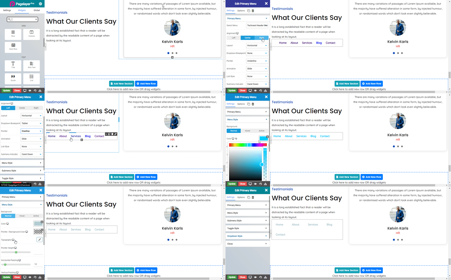
primarymenu_01

Primary Menu

Menu items

  • Title : Enter the name to be displayed for the menu item.
  • Menu Type : Select the type of menu you want to make.
  • Flyout : The flyout option helps to create a classic and simple menu.
  • Mega menu : The mega menu option creates a extendable menu with a container that can incorporate other widgets you may wish to display.
NOTE -To understand more about creating and designing a mega menu CLICK HERE.
  • Column Menu: The column menu option creates a extendable menu which displays all the subpages of the website in a column format.
NOTE -To understand more about creating and designing a column menu CLICK HERE.
  • Icon : Select the icon to be displayed with the menu item.

Menu Style

  • Alignment : Choose the alignment of the menu.
  • Layout : Select the layout of the menu from Horizontal, Vertical and Dropdown.
  • Dropdown Breakpoint : Select a device name in which menu layout is converted into dropdown.
  • Pointer : Select an hover style for menu.
  • Animation : Select an animation style for pointer.
  • List Style : Select a list dot style which works when menu layout is selected Vertical.
  • Submenu Indicator : Select style for arrow icon of menu.
  • Submenu Animation : Select an animation style for the submenu container.
Normal
  • Color : Set the menu text color.
  • Alignment : Choose the alignment of the menu.
Hover
  • Color : Set the menu text color.
  • Background Color : Set the menu text background color.
Active
  • Color : Set the menu text color.
  • Background Color : Set the menu text background color.
  • Typography : Set the font and text style of menu.
  • Pointer Height  : Set the height for the pointer on hover.
  • Horizontal Padding : Set the horizontal padding of the menu.
  • Vertical Padding : Set the vertical padding of the menu.

SubMenu Style

  • Item Alignment : Choose the alignment of the submenu.
  • Position : Makes the submenu sticky to right or left based on the selection..
Normal
  • Color : Set the submenu text color.
  • Background Color : Set the submenu text background color.
Hover
  • Color : Set the submenu text color.
  • Background Color : Set the submenu text background color.
Active
  • Color : Set the submenu text color.
  • Background Color : Set the submenu text background color.
  • Typography : Set the font and text style of submenu.
  • Horizontal Padding : Set the horizontal padding of the submenu.
  • Vertical Padding : Set the vertical padding of the submenu.
  • Left Margin : Set the left margin of the submenu.
  • Z- Index : Set the z-index for the submenu.

Toggle Style

  • Icon : Choose the icon type from the list of icons.
  • Alignment : Choose the alignment of the toggle button, It works when layout is selected to dropdown.
  • Color : Set the bars color.
  • Background Color : Set the toggle button background color.
  • Font Size : Set the size of toggle button icon.
  • Padding : Set the padding of the toggle button.
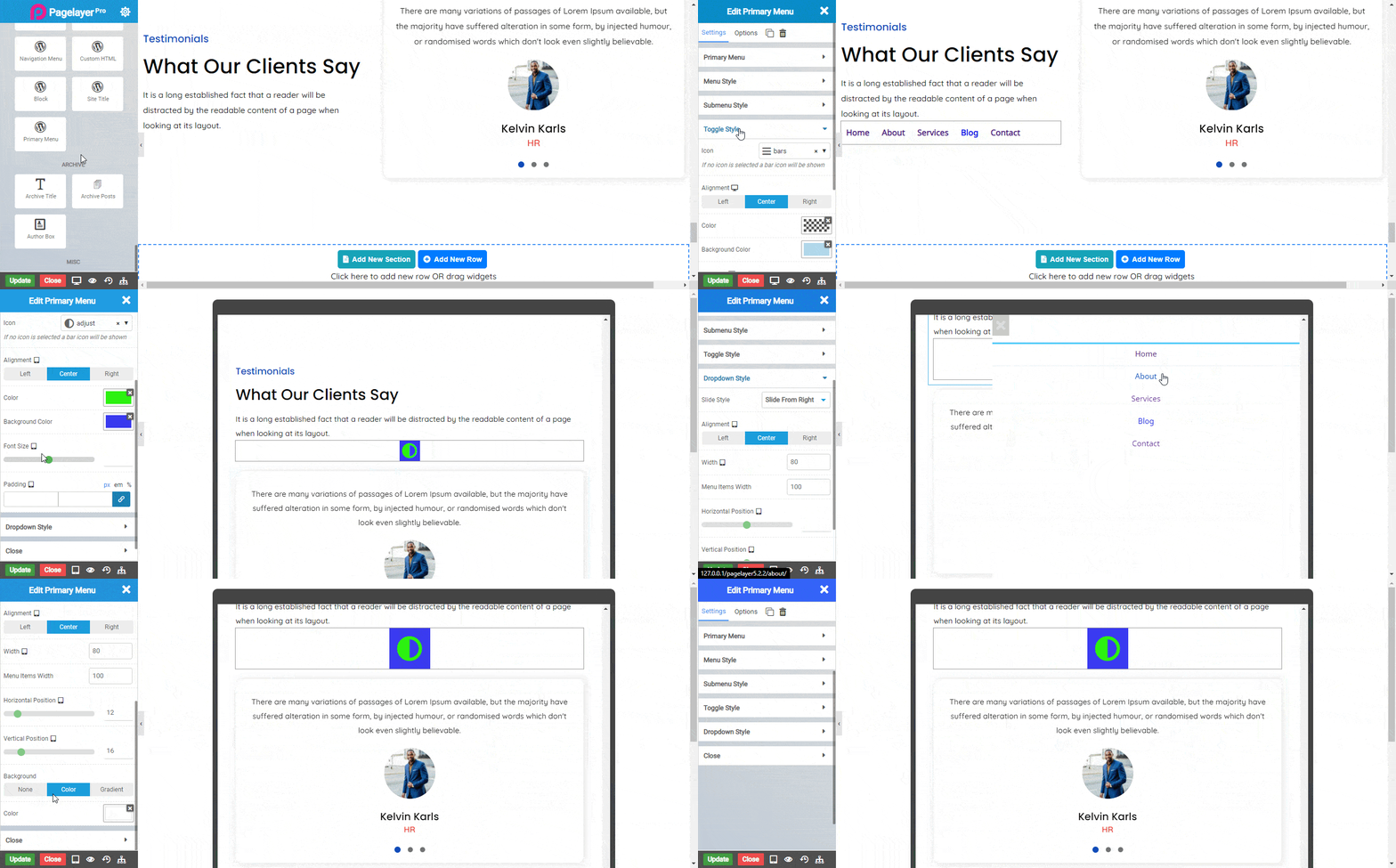
primarymenu_02
Note : It works when layout is selected to dropdown.

Dropdown Style

Slide Style
  • Slide Down
  • Width : Set width of the submenu.
  • Slide From Right
  • Width : Set width of the submenu.
  • Menu Items Width : Set the width of submenu items.
  • Horizontal Position : Set the horizontal position of the submenu items.
  • Vertical Position : Set the vertical position of the submenu items.
  • Slide From Left
  • Width : Set width of the submenu.
  • Menu Items Width : Set the width of submenu items.
  • Horizontal Position : Set the horizontal position of the submenu items.
  • Vertical Position : Set the vertical position of the submenu items.
  • Full Screen
  • Menu Items Width : Set the width of submenu items.
  • Horizontal Position : Set the horizontal position of the submenu items.
  • Vertical Position : Set the vertical position of the submenu items.
Background : Select background of submenu from None, Color(select any color you want), Gradient(set value of gradien).

Close

  • Font Size : Set the size of close icon.
  • Padding : Set the space around close icon.
  • Horizontal Position : Set the horizontal position of close button.
  • Vertical Position : Set the vertical position of close button.
  • Normal
  • Color : Set color of close button.
  • Background Color : Set background color of close button.
  • Hover
  • Color : Set color of close button.
  • Background Color : Set background color of close button.
Note :In advance option tab . Do more styling to the Primary menu Widget. To know more about advance option tab. CLICK HERE
    Was this page helpful?
    Newsletter Subscription
    Subscribing you to the mailing list