pagelayer-logo-256
Request A Demo
By entering your email, you agree to our Terms of Service and Privacy Policy
love-subscribe

Download Pagelayer Plugin

Subscribe to our Newsletter for WordPress related news and tutorials and get a 25% discount !

New year Offer
35% Off

Offer Expired

Days
Hours
Minutes
Seconds
COUPON CODE - NEWYEAR
Download
Advance Styling Options

Overview

In this documentation, we will show you how to Style your particular element. Firstly, you will need to access your appropriate page in which you have to make the styling effects.

Choose the appropriate widget you want to style and go to Options Tab.

NOTE - The option Tab is same for all Widgets.

Options Tab

Background Style

This option allows you to style the background of your appropriate element. You can choose the Background State in which you want to display the styling to your appropriate element viz Normal or Hover. And can also choose the background type you want to display.
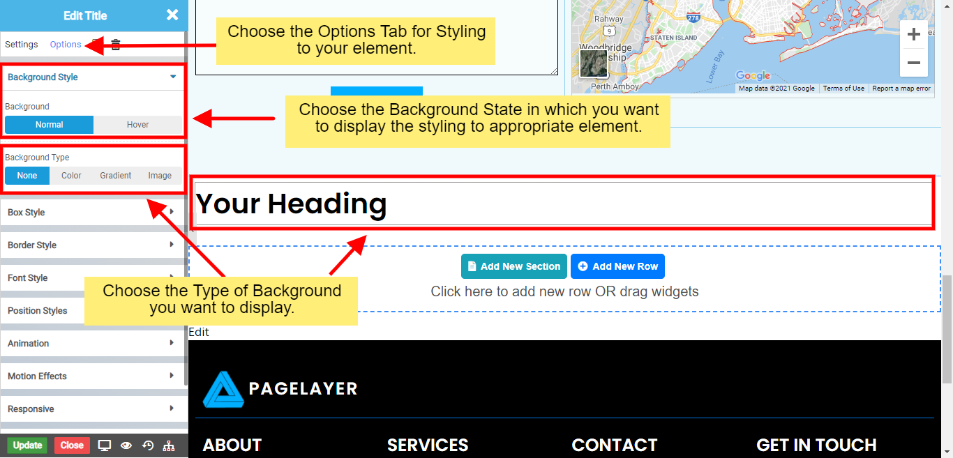
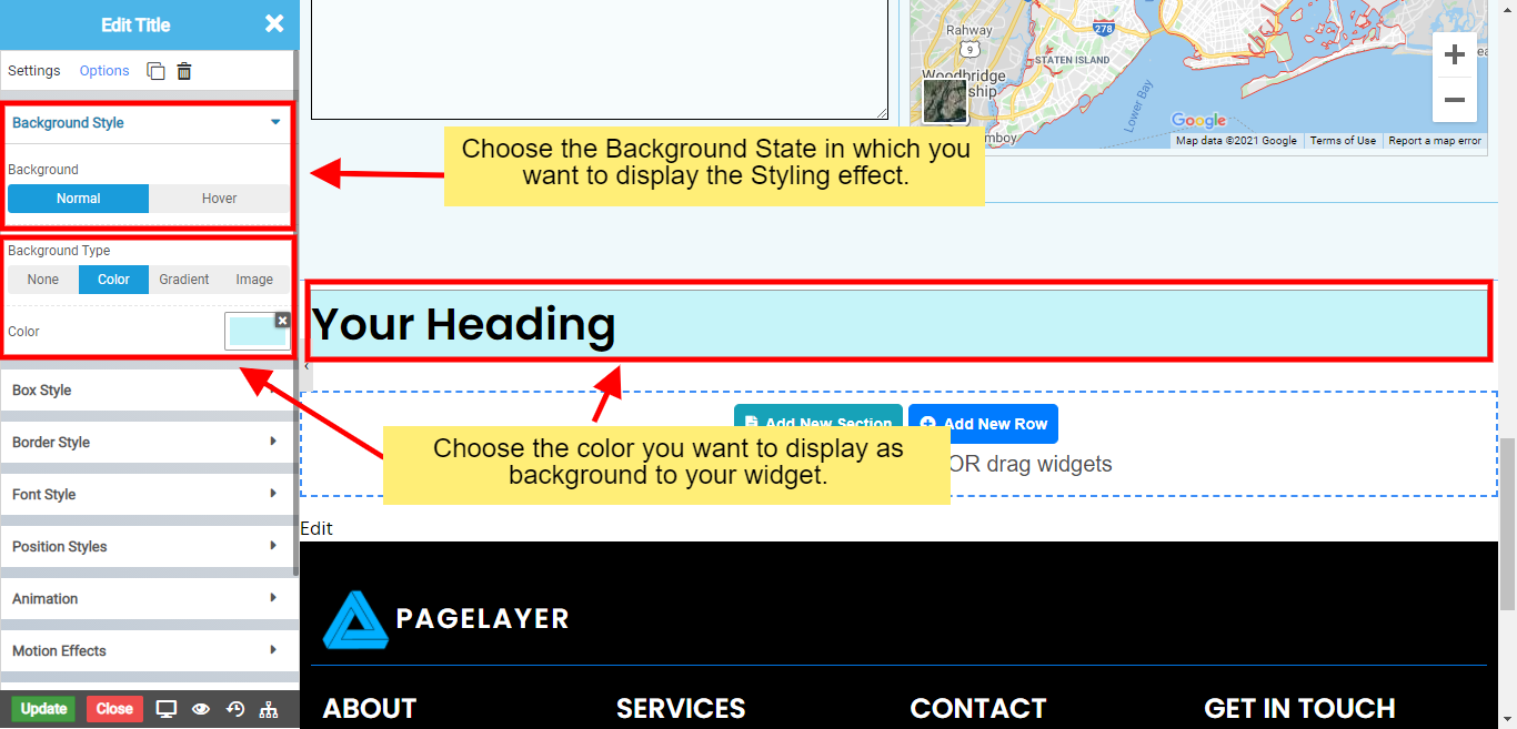
  • None: Where no background will be displayed.
  • Background None

  • Color: Choose if you want to set the background color to your element.
  • Background Color

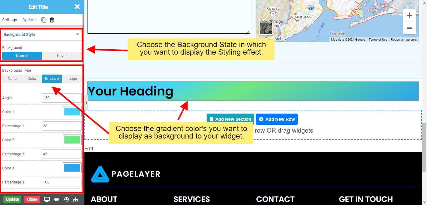
  • Gradient: Choose if you want to set the background as gradient to your element.
  • Background Gradient

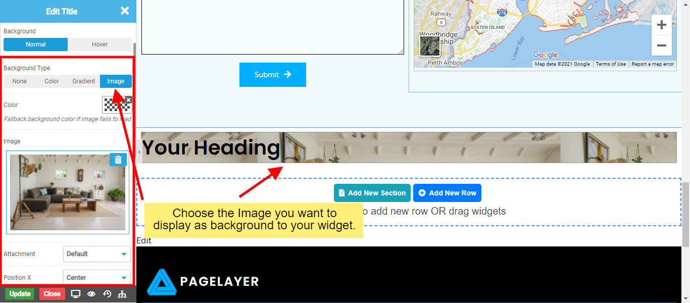
  • Image: Choose if you want to set the background as image to your element.
  • Background Image
    • Attachment : Set the type of background attachment as Scroll or Fixed. Default is set to Scroll.
    • Position X : Set the X Position of the background image as Center, Left, or Right. You can also set Custom X Position to the background image by choosing Custom type.
    • Position Y : Set the Y Position of the background image as Center, Top or Bottom. You can also set Custom Y Position to the background image by choosing Custom type.
    • Repeat : Choose the repeat styling of the background image as Repeat, No-Repeat, Repeat-X, Repeat-Y.
    • Size : Choose the size type of the background image as Cover or Contain.

    Box Style

    This option helps you to set the Margin, Padding, Z-index and Shadows to your appropriate widget.
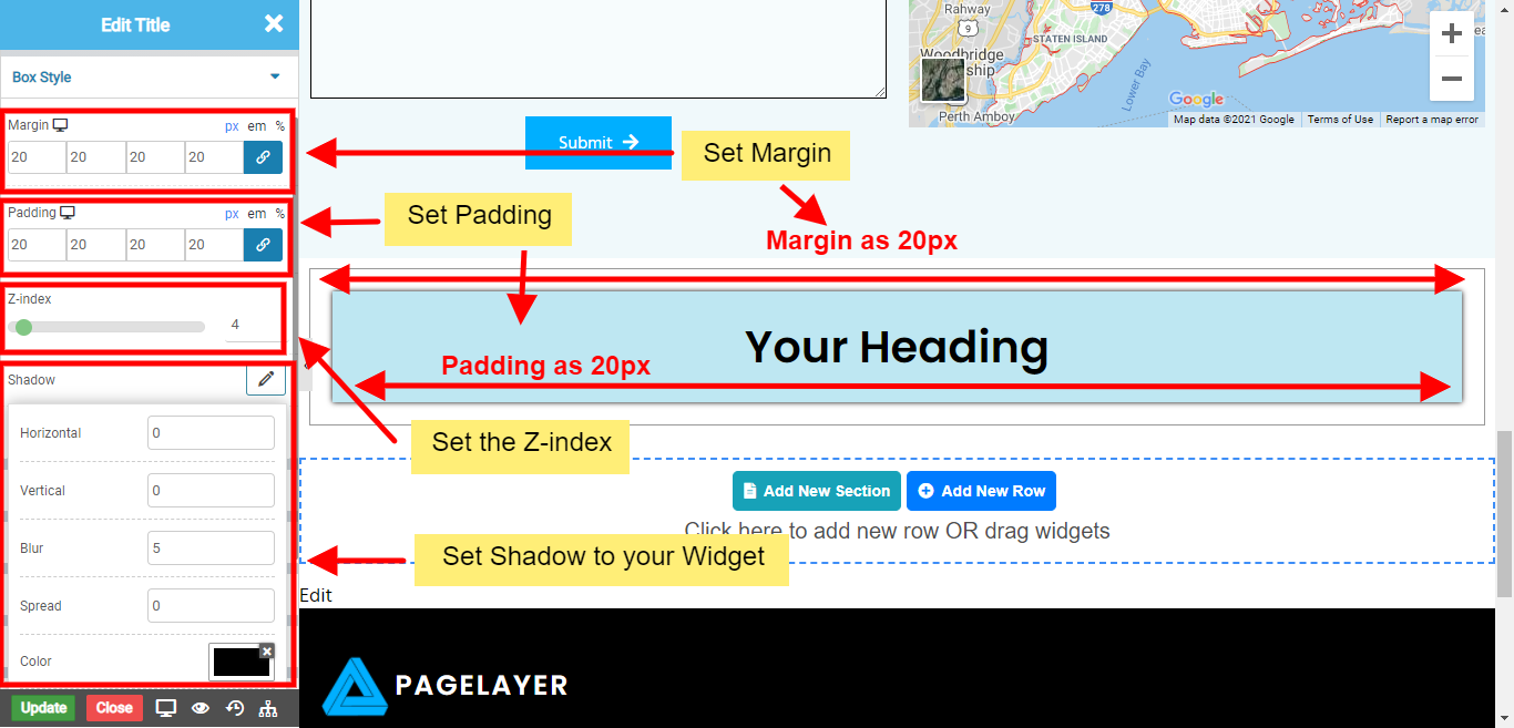
    • Margin : Set the outer spacing to your appropriate widget.
    • Padding : Set the inner spacing to your appropriate widget.
    • Z-index : Set the Z-index to your appropriate widget. The z-index property specifies the stack order of an element. An element with greater stack order is always in front of an element with a lower stack order.
    • Shadow : Set the Shadow to your appropriate widget.
    • Shadow on Hover : Set the Shadow to your appropriate widget on hover.
    Box Style

    Border Style

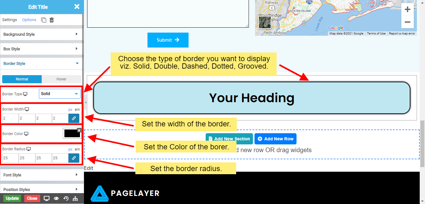
    This option helps you to set the Border to your appropriate widget on the state you want to display. There are different type of border's viz.

  • Solid
  • Solid Border

  • Double
  • Double Border

  • Dotted
  • Dotted Border

  • Dashed
  • Dashed Border

  • Groove
  • Groove Border

    Border Style

    Font Style

    This option helps you to set the Font Style to the appropriate widget you want to display.
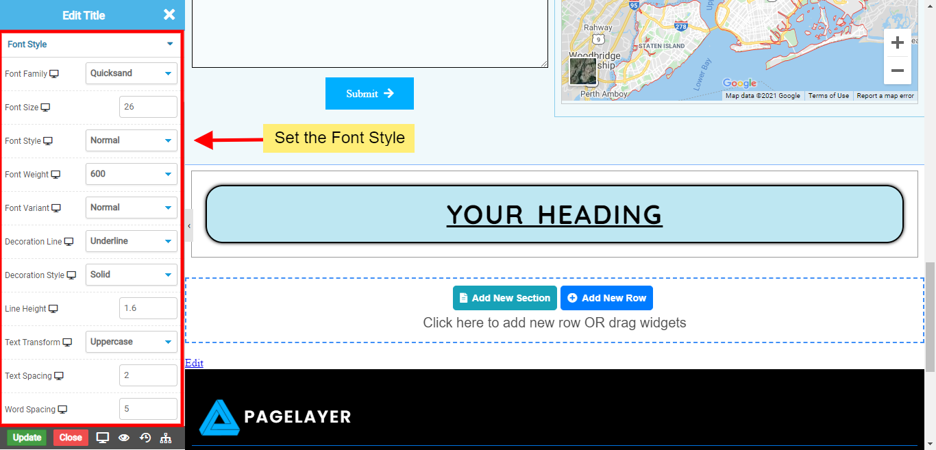
    • Font Family : Set the Font Family to your appropriate widget. There are 100+ google fonts available.
    • Font Size : Set the font size to your appropriate widget.
    • Font Style : Set the font style to your appropriate widget from the list of style viz. Normal, Italic, Oblique.
    • Font Weight : Set the font weight to your appropriate widget from the list of weights viz. 100, 200, 300, 400, 500, 600, 700, 800, 900, Normal, Lighter, Bold, Bolder, Unset.
    • Font Variant : Set the font variant to your appropriate widget from the list of variants viz. Normal, Small Caps.
    • Decoration Line : Set the line decoration to your appropriate widget from the list of line decorations viz. Overline, Underline Line Through, Underline Overline.
    • Decoration Style : Set the line decoration style to your appropriate widget from the list of line decorations style viz. Solid, Double, Dotted, Dashed, Wavy.
    • Line Height : Set the line height to your appropriate widget.
    • Text Transform : Set the text transform to your appropriate widget from the list of text transform viz. Capitalize, Uppercase, Lowercase.
    • Text Spacing : Set the text spacing between different alphabets to your appropriate widget.
    • Word Spacing : Set the word spacing between different words to your appropriate widget.
    Font Style

    Position Style

    This option helps you to set the Position Style to the appropriate widget you want to display.
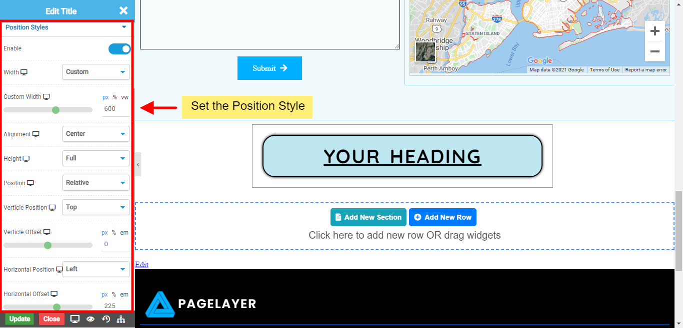
    • Width : You can set the width of element to Full Size or any custom size you want. Selecting Custom as Width allows you to set custom width size position to your element.
    • Alignment : You can set the widget alignment to Left, Center or Right with in your set width size.
    • Height : You can set the height of element to Full Size or any custom size you want. Selecting Custom as Height allows you to set custom height size position to your element.
    • Position : You can position your dragged widget to Absolute, Fixed, Relative the way you want. Selecting any position will allow you set it's Vertical and Horizontal Position.
    • Vertical Position : This position will allow you to set your Widget's Vertical Position to Top or Bottom. Selecting the desired vertical position will allow you to set the Vertical Offset of the Element.
    • Horizontal Position : This position will allow you to set your Widget's Horizontal Position to Left or Right. Selecting the desired horizontal position will allow you to set the Horizontal Offset of the Element.
    Position Style

    Animation

    This option helps you to set the Animation to the appropriate widget you want to display.

    • Animation : To set the animation on page load from the list of different animations.
    • Speed : Set the speed on which animation of page load should appear viz. Fast, Normal, Small, Fastest, Slowest.
    • Delay : Set the delay on which animation of page load should appear.
    • Hover Animation : Set the animation to appear on hover of appropriate widget.
    • Scrolling Sticky : Set the offset on which the appropriate widget must be sticky at top or bottom. To know more about animation. Click Here

    Motion Effects

    This option helps you to set the Mouse Effects to the appropriate widget you want to display. Also, choose the option in which mouse effect take place viz. Scrolling or Mouse.

    Scrolling Effects

    • Vertical Scroll : To Scroll the Widget Vertically on Scrolling.
    • Horizontal Scroll : To Scroll the Widget Horizontally on Scrolling.
    • Transparency : Set the transparency to your appropriate widget on Scrolling.
    • Blur : To make appropriate widget blur on Scrolling.
    • Rotate : To make appropriate widget rotate on Scrolling.
    • Scale : To make scale of appropriate widget large or small on scrolling.

    Mouse Effects

    • Mouse Track : To track the Widget as mouse moves.
    • 3D Tilt : Set the 3D Tilt to tilt the transformation of the widget on mouse moves.

    Responsive

    This option helps you to hide the appropriate widget on devices you want.

    • Hide on Desktop : To hide the widget in Desktop Devices.
    • Hide on Tablet : To hide the widget in Tablet Devices.
    • Hide on Mobile : To hide the widget in Mobile Devices.

    Attributes

    This option helps you to set the custom attributes to your appropriate widget.

    • Syntax: key1=value1;key2=value2;

    Custom CSS

    This option helps you to set the custom css to your appropriate widget.

    • Element Id : You can add your custom ID without Hash(#)
    • CSS Class : You can add your custom Class without dot(.)
    • Custom CSS : To target current widget use {{element}}.
      Example : {{element}} .className{ color: red; }
      Was this page helpful?
      Newsletter Subscription
      Subscribing you to the mailing list