pagelayer-logo-256
Request A Demo
By entering your email, you agree to our Terms of Service and Privacy Policy
love-subscribe

Download Pagelayer Plugin

Subscribe to our Newsletter for WordPress related news and tutorials and get a 25% discount !

New year Offer
35% Off

Offer Expired

Days
Hours
Minutes
Seconds
COUPON CODE - NEWYEAR
Download
Pagelayer Popup Template Builder

Overview

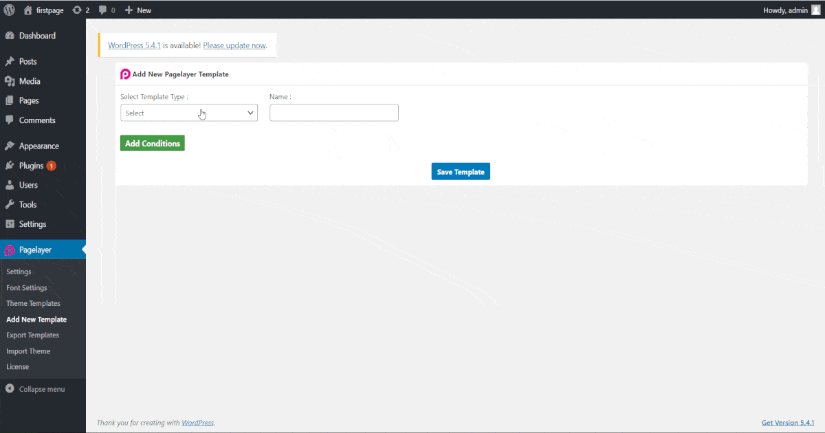
The Popup Template allows you to make and design popups. Popups is a type of template and box which appears according to the user needs like, it appears after page loads, when user scroll the page etc. In pagelayer, popup are fully customizable that means you can make popup using our widgets.
The following GIF's video to show you how to use the popup template and the various options available :
popup1
popup2
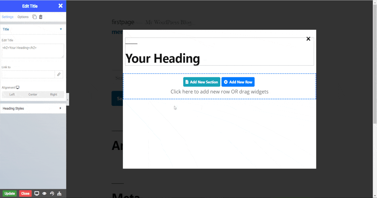
NOTE - To access popup settings after customizing the popup you have to click gear button on the right side of pagelayer brand name.
popup setting

Popup Layout

  • Width - Set width of popup box.
  • Height - Set height of popup box.
  • Horizontal - Choose alignment of popup in horizontal line.
  • Vertical - Choose alignment of popup in vertical line.
  • Animation - Select any animation for popup.
  • Delay -Set delay for animation.

Popup Styles

  • Background Color - Set background color of popup.
Normal
  • Border Type - Choose the border type from Solid, Double, Dotted, Dashed, and Groove.
  • Border Color - Set the Border Color.
  • Border Width - Set the width to control the thickness of the border around the button.
  • Border Radius - Set the border radius to control corner roundness.
Hover
  • Border Type - Choose the border type from Solid, Double, Dotted, Dashed, and Groove.
  • Border Color - Set the Border Color.
  • Border Width - Set the width to control the thickness of the border around the button.
  • Border Radius - Set the border radius to control corner roundness.

Overlay

  • Enable Overlay - Toggle to display overlay around popup.

Close

  • Closed By Overlay - Toggle to allow closing of popup by clicking on overlay.
  • Closed By Selector - Toggle to allow closing of popup by clicking on popup element.
  • Close Button - Toggle display of close button..
  • Position - Select position of close button.
  • Vertical Position - Set vertical position of close button.
  • Horizontal Position - Set horizontal position of close button.
  • Size - Set size of close button.
  • Padding - Set padding around close button.
Normal
  • Color - Set the color of the close button.
  • Background Color - Set the background color of the close button.
  • Border Type - Choose the border type from Solid, Double, Dotted, Dashed, and Groove.
  • Border Color - Set the Border Color.
  • Border Width - Set the width to control the thickness of the border around the close button.
  • Border Radius - Set the border radius to control corner roundness.
Hover
  • Color - Set the color of the close button.
  • Background Color - Set the background color of the close button.
  • Border Type - Choose the border type from Solid, Double, Dotted, Dashed, and Groove.
  • Border Color - Set the Border Color.
  • Border Width - Set the width to control the thickness of the border around the close button.
  • Border Radius - Set the border radius to control corner roundness.

Action Triggers

  • On Click - Toggle to show popup when user click on site.
  • On Page Load - Toggle to show popup after page loads fully.
  • On Scroll - Toggle to show popup when user scroll page.
  • On Scroll To Element - Toggle to show popup when user scroll over a certain element.
  • On Page Exit Intent - Toggle to show popup when user try to move cursor out of browser screen.

Advance Option

  • Popup Show Multiple Time - Toggle to show popup multiple time on web page.
  • Set Cookie Session - Toggle to show popup after page loads fully.
  • Automatically Close After(Sec) - Set time of closing of popup.
    Was this page helpful?
    Newsletter Subscription
    Subscribing you to the mailing list