Overview
The Tabs Widget allows you to separate your information into tabs, either horizontally or vertically, it allows you use icons next to the title.
Screenshot
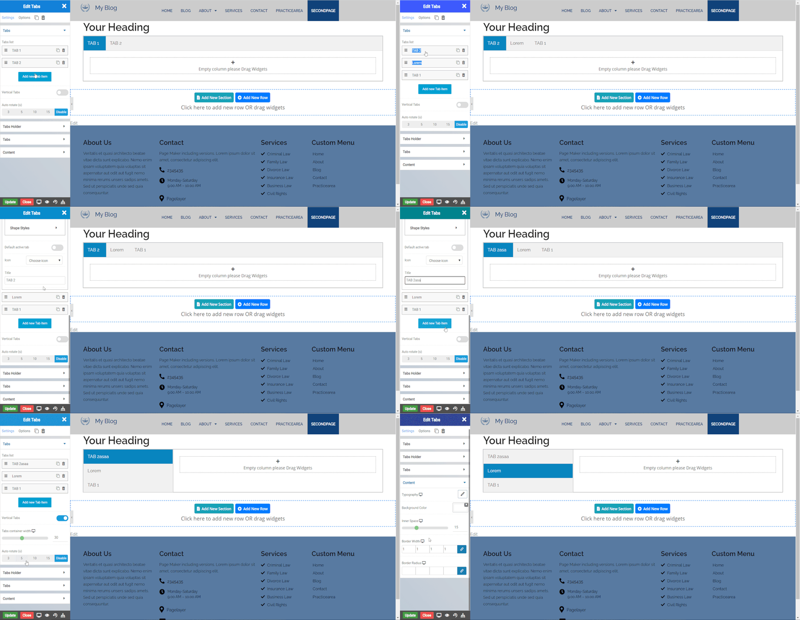
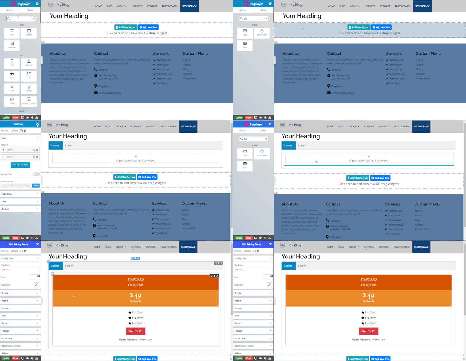
The following is a GIF video to show you how to use the Tabs widget and the various options available :

Note:- Now you can insert widgets inside the tabs.

Tabs
- Tabs List : Click Add new Tab Item to add the multiples tab. After the tab is added click on tab to add the details of tab.
Tab
Inner Row
This contain all the settings of Inner row widget so to check all the details of settings then Click Here.
- Default Active Tab : The tab which you want to show active, click on that tab and enable the default active tab button by just clicking on that slide button
- Icon : Choose the icon which will set next to the title of the tab
- Title : Enter the title of tab.
- Vertical Tabs : Click slide button to show the tabs vertically
- Auto Rotate : Select the time available in seconds to Rotate the active on tabs
Tabs Holder
- Background Color : Set the tab holder background color
- Border Type : Set the border type
- Border Color : Set the border color
- Border Width : Set the border width
- Border Radius : Set the border radius
Tabs
- Alignment : Align the tabs to left, right and center
- Color : Set the color of tab title text
- Background Color : Set the background color of tab
- Active Tab Color : Set the active tab background color
- Typography : Set the typography of tab title
- Icon Position : Set the icon to appear left or right to the tab title
- Icon Spacing : Set the space between icon and the tab title
Content
- Typography : Set the typography of tab content
- Background color : Set the content background color
- Inner Space : Set the space around the content
- Border Width : Set the border width of content area
- Border Radius : Set the border radius of content area
NOTE - In advance option tab . Do more styling to the Tabs.To know more about advance option tab. CLICK HERE


