Overview
The Author Box Widget allows you to embed blog's author details like image, name and description with all type of customization.
Screenshot
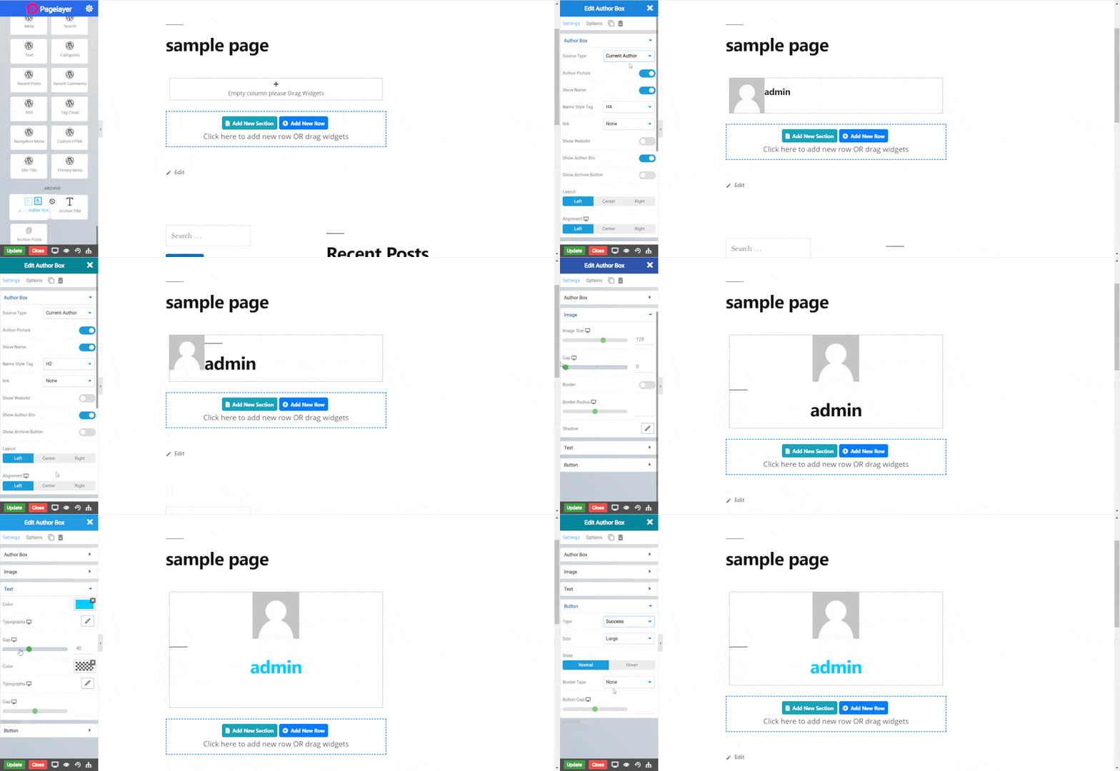
The following is a GIF video to show you how to use the author box widget and the various options available :

Author Box Widget
The following is a author box widget :
Author Box
- Source Type : Select source of information. Current Author dynamically display the current post’s author box. Custom source allows you to provide data like image, title and description.
- Author Picture : Toggle display of author image.
- Show Name : Toggle display of title.
- Name Style Tag : Select title style.
- Link : Link the Author Name and Image to your website or your post archive.
- Show Website : Toggle to add a link of your website.
- Show Author Bio : Toggle to show author bio or description.
- Show Archive Button : Toggle to show archive button.
- Layout : Choose side of image.
- Alignment : Choose alignment of whole box.
Image
- Image : Set the size of image.
- Gap : Set the space between image and title.
- Border : Toggle display of border.
- Border Radius : Set the radius of border.
- Shadow : Set shadow of image.
Text
- Color : Set color of title.
- Typography : Set the font and text style of title.
- Gap : Set space between title and description.
- Color : Set color of description.
- Typography : Set the font and text style of description.
- Gap : Set space between description and archive butto.
- Type : Select the styles of buttons to begin your design. Choose from Primary, Success, Info, Warning, Danger etc. If you want to design your own button from other than these options then select Custom from the drop down, after selecting the custom you will get the option State in which you can design the button in Normal and Hover State.
- Size : Select the Size of button, default is selected to Large. Choose from Mini, Small, Large, Extra Large, Double Large. If you want to give size to your own button from other than these options then select Custom from the drop down, after selecting the custom you will get the input State in which you can give any size but it should be less then hundered.
- Border Type : Set the border type.
- Border Color : Set the border color.
- Border Width : Set the border width.
- Border Radius : Set the border radius.
Hover
- Border Type : Set the border type.
- Border Color : Set the border color.
- Border Width : Set the border width.
- Border Radius : Set the border radius.
- Button Gap : Set gap between button and other widgets.
NOTE - In advance option tab . Do more styling to the Author Box Widget. To know more about advance option tab. CLICK HERE


