Overview
The Hotspot Group Widget allow you to add an interactive image in your web page. It is a fully customizable widget in which you can define certain area of image using hotspots.
Screenshot
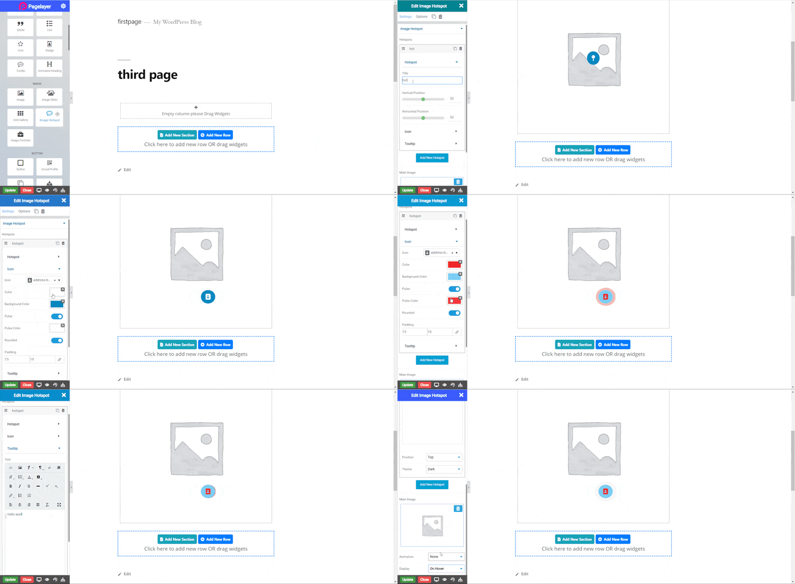
The following is a GIF video to show you how to use the image hotspot widget and the various options available :

Image Hotspot Widget
The following is a Image Hotspot Widget :

Hotspots Group

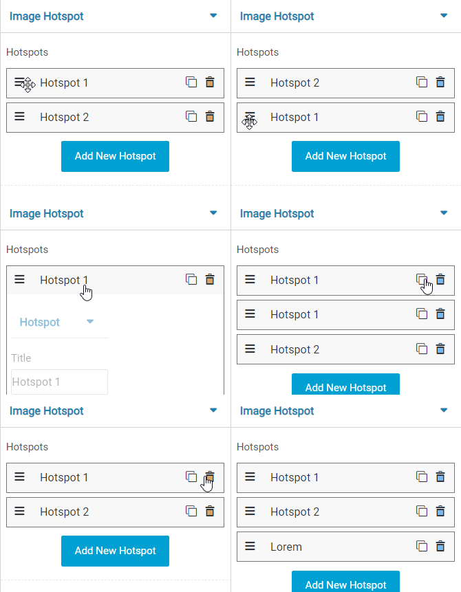
- Drag & Drop : Using this button you can easily rearrange your group by just drag and drop.
- Edit : This button show or hide all the settings of individual element in the group.
- Clone / Copy : This button creates copy of that element on which it is pressed.
- Delete : Delete an element.
- Add : Add new element.
Hotspot
- Title : Set the title of image.
- Vertical Position : Set the vertical position of Hotspot.
- Horizontal Position : Set the horizontal position of Hotspot.
Icon
- Icon : Select the icon from the icons list for the hotspot.
- Color : Choose the color of the icon.
- Background Color : Choose the background color of the icon.
- Pulse : Toggle this button for Pulse effect on hotspot.
- Pulse Color : Set color of Pulse of hotspot.
- Rounded : Toggle the roundness of hotspot.
- Padding : set the padding of hotspot.
Tooltip
- Rich Text Editor : Enter text of tooltip and edit, for more information click this Link.
- Position : Select the position of tooltip, default is Top.
- Theme : Select the theme of tooltip to begin your design. If you want to give your own custom theme then you have to select Custom and select color and background color for the tooltip otherwise Dark theme is default selected.
- Main Image : Select the image you want to display.
- Animation : Select the animation for the tooltip.
- Display : Select this option to display the tooltip.
NOTE - In advance option tab . Do more styling to the Image Hotspot Widget. To know more about advance option tab. CLICK HERE


