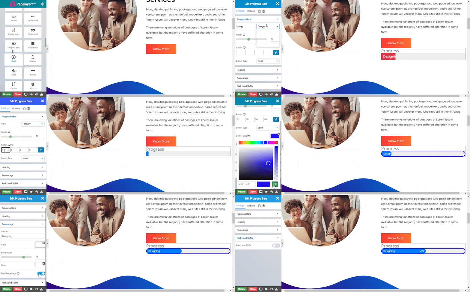
The Progress Bar widget allows you to add fully styled progress bars to your page.
These are great for displaying varying types of data and content to your viewers. The Progress Bar Element includes several options for easy customization and is a great way to both visually attract the viewer and display content in an easily digestible form.

Content
- Type : Choose the Type Primary , Secondary , Success , Warning , Danger or Custom .
- Height : Set the height of the progress bar.
- Radius : Add roundness to border.
- Border type : Choose the border type None , Solid , Double , Dashed or Groove.
- Border color : Give border Color.
Heading
- Title : Enter the title text that is displayed above the progress bar.
- Title Color : Choose the color of the title text.
- Alignment : Set the alignment of the Text.
- Typography : Choose the Font-name, size, boldness, text-decoration, letter-spacing.
Percentage
- Content : Enter the text that is displayed in the progress bar.
- Color : Set the color of the text.
- Percentage : Set the completion percentage number.
- Color: Change the color of the percentage text.
- Hide Percentage: Show or hide the actual percentage number text at the end of the bar.
Prefix and Suffix
- Prefix and Suffix : Enable the toggle to show the prefix and suffix.
- Prefix Title : Give Title to Prefix at the top left corner will see the prefix title
- Suffix Title : Give Title to Suffix at the top right corner will see the suffix title
- Color : Set the color to prefix and suffix.
NOTE - In advance option tab . Do more styling to the Progress Bar Widget.To know more about advance option tab. CLICK HERE


