Overview
The Call To Action Widget takes all your hassle in making of advertising and marketing element in web page. You can fully customize this widget and use any where in the page because the scope of this widget is very large due to full customization.
Call To Action Widget
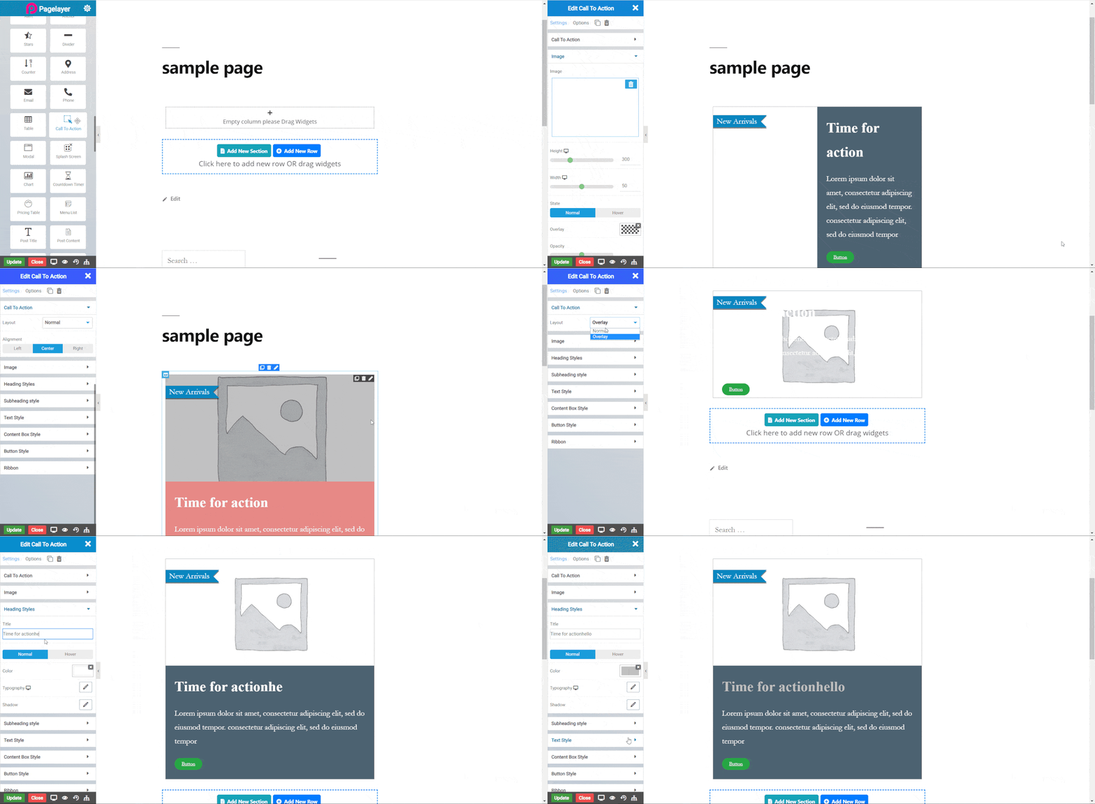
The following is a call to action widget :
New Arrivals
Time for action
Lorem ipsum dolor sit amet, consectetur adipiscing elit, sed do eiusmod tempor. consectetur adipiscing elit, sed do eiusmod tempor
Call To Action
- Layout : Select option to change layout of call to action (CTA).
- Alignment : Select the alignment of CTA, default is left.
Image
- Image : Select the image you want to display.
- Width : Set the width of the image.
- Height : Set the Height of the image.
Normal
- Overlay : Set color of overlay for image.
- Opacity : Set opacity of overlay.
Hover
- Delay : Set delay for hover.
- Overlay : Set color of overlay for image.
- Opacity : Set opacity of overlay.
- Hover Animation : Select animation for overlay hover.
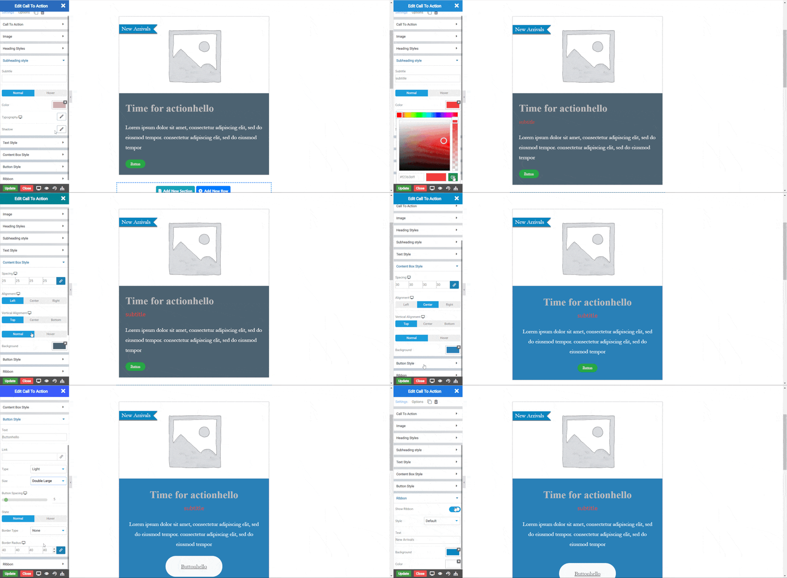
Heading Styles
- Title : Enter the title of (CTA).
Normal
- Color : Set the color of the title text.
Hover
- Delay : Set delay for color of title.
- Color : Set the color of the title text.
- Typography : Set the font and text style of title.
- Shadow : Set the shadow of title.
Subheading Styles

- Subtitle : Enter the subtitle of (CTA).
Normal
- Color : Set the color of the subtitle text.
Hover
- Delay : Set delay for color of subtitle.
- Color : Set the color of the subtitle text.
- Typography : Set the font and text style of subtitle.
- Shadow : Set the shadow of subtitle .
Text Style
- Text : Enter text and edit the text. Click Here to see more.
Context Box Style
- Spacing : Set the spacing around the content box.
- Alignment : Select the alignment of content box, default is left.
- Vertical Alignment : Select the vertical alignment of content box.
Normal
- Background Color : Set the background color of the content box.
Hover
- Delay : Set delay for color of title.
- Background Color : Set the background color of the content box.
Button Style
- Button Text : Enter the Button text.
- Link : Enter the URL for Button link.
- Type : Select the styles of buttons to begin your design. Choose from Primary, Success, Info, Warning, Danger etc. If you want to design your own button from other than these options then select Custom from the drop down, after selecting the custom you will get the option State in which you can design the button in Normal and Hover State.
- Size : Select the Size of button, default is selected to mini. Choose from Mini, Small, Large, Extra Large, Double Large. If you want to give size to your own button from other than these options then select Custom from the drop down, after selecting the custom you will get the input State in which you can give any size but it should be less then hundered.
Normal
- Border Type : Choose the border type from Solid, Double, Dotted, Dashed, and Groove.
- Border Color : Set the Border Color
- Border Width : Set the width to control the thickness of the border around the button
- Border Radius : Set the border radius to control corner roundness
Hover
- Border Type : Choose the border type from Solid, Double, Dotted, Dashed, and Groove.
- Border Color : Set the Border Color
- Border Width : Set the width to control the thickness of the border around the button
- Border Radius : Set the border radius to control corner roundness
Ribbon
- Show Ribbon : Toggle the display of ribbon.
- Text : Enter the ribbon text.
- Background Color : Set the background color of the ribbon.
- Color : Set the color of the ribbon text.
- Typography : Set the font and text style of ribbon text.
- Position : Choose the position of ribbon.
- Vertical Position : Set the vertical position of ribbon.
- Space Around : Set the space around ribbon text.
- Height : Set the Height of ribbon.
- Shadow Color : Set color of ribbon shadow.
- Shadow Position : Set position of ribbon shadow.
NOTE - In advance option tab . Do more styling to the Call to action Widget. To know more about advance option tab. CLICK HERE


