
Overview
This Contact Form widget allows you to create form which can be use to communicate with site owner.
This widget provides different type of form fields and styling option which helps create a contact form in a easiest way possible.
Options
Form Options

Label Style

Input Style

Radio and Checkbox Style
Form Style
Solid Border
Double Border
Dotted Border
Dashed Border
Groove Border

Button Style
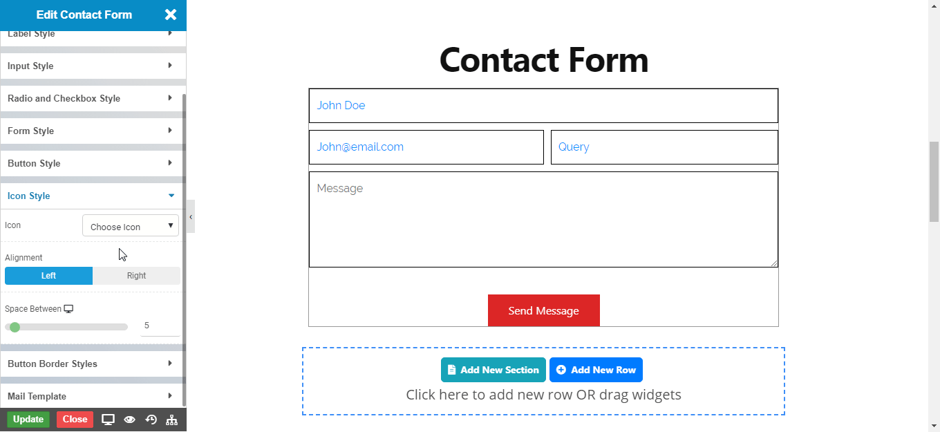
Icon Style
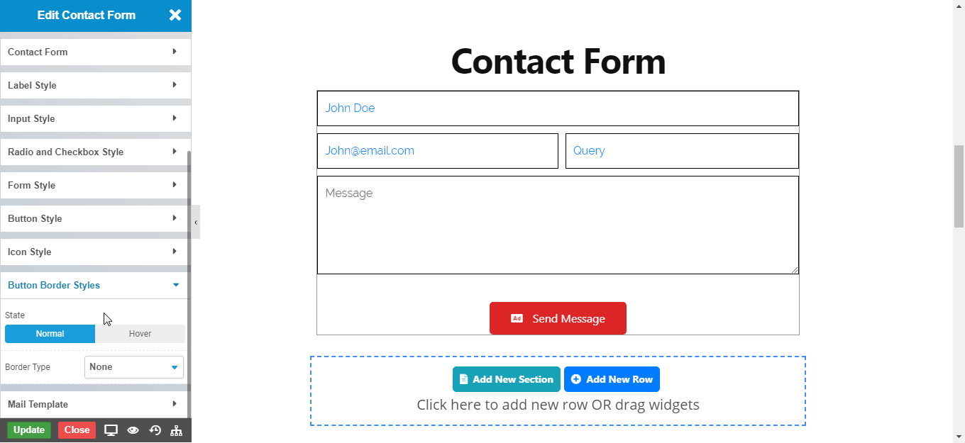
Button Border Style
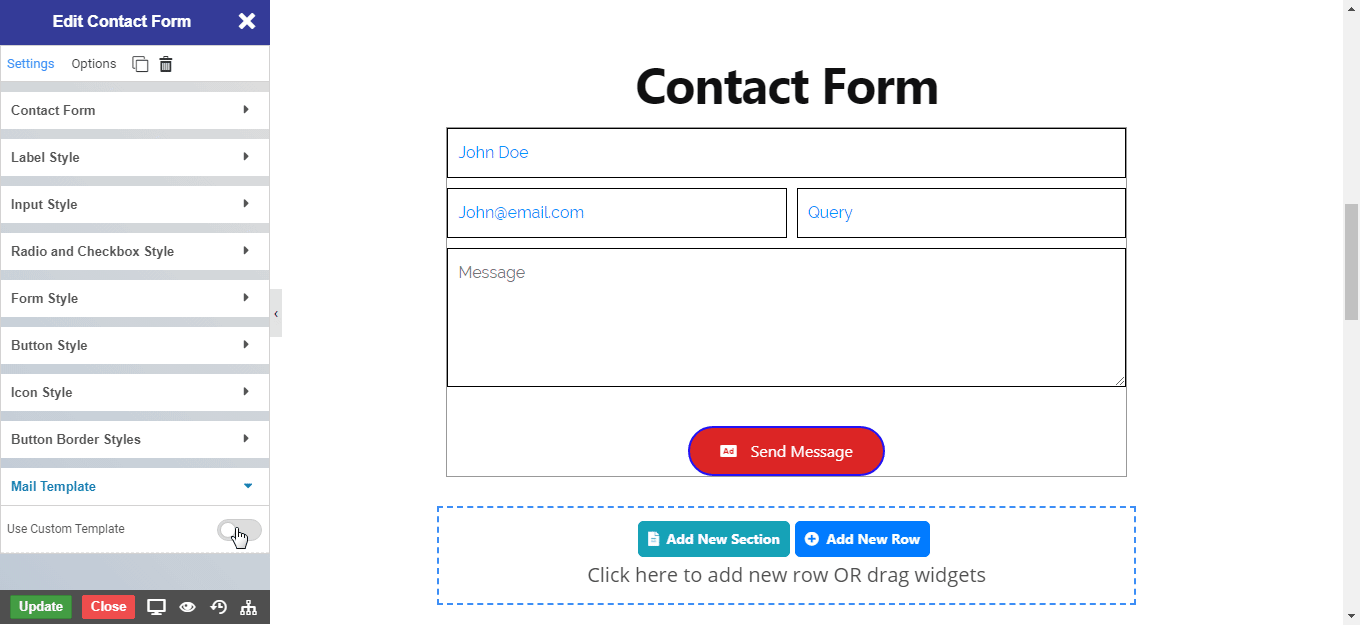
Mail Template
NOTE - To Known More Information CLICK HERE
NOTE - In advance option tab . Do more styling to the Contact Form Widget. To know more about advance option tab. CLICK HERE