pagelayer-logo-256
Request A Demo
By entering your email, you agree to our Terms of Service and Privacy Policy
love-subscribe

Download Pagelayer Plugin

Subscribe to our Newsletter for WordPress related news and tutorials and get a 25% discount !

New year Offer
35% Off

Offer Expired

Days
Hours
Minutes
Seconds
COUPON CODE - NEWYEAR
Download
Flipbox

Overview

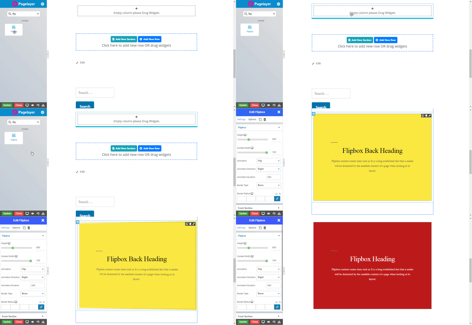
A Flip Box widget is a widget which allows you to flip your content when you hover over it. Here, you can display alot of content with very less space. You can even choose different animations, and customize the look and behavior of each flip box.

Flip boxes helps you to make your content more interesting with its different effects, and improves the user experience.
flipbox_overview

Options

Flipbox

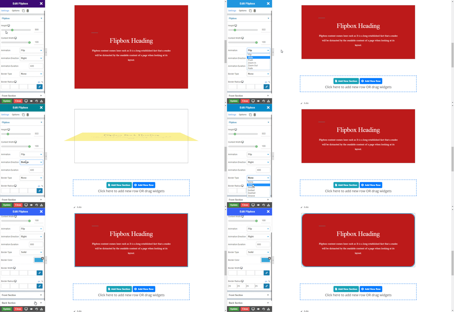
  • Height : Set the height of the flipbox you want to display. 
  • Content Width : Set the width of content in flipbox you want to display. 
  • Animation : Choose the type of animation to flip the content from Flip, Slide, Push, Zoom In, Zoom Out, Fade.
  • Flip : To animate the content as flip. Take the mouse below on Flip Front to see the flip effect.

Flip Front

Flip Back

  • Slide : To animate the content as slide. Take the mouse below on Slide Front to see the slide effect.

Slide Front

Slide Back

  • Push : To animate the content as push. Take the mouse below on Push Front to see the push effect.

Push Front

Push Back

  • Zoom In : To animate the content as zoom in. Take the mouse below on Zoom In Front to see the zoom in effect.

Zoom In Front

Zoom In Back

  • Zoom Out : To animate the content as zoom out. Take the mouse below on Zoom Out Front to see the zoom out effect.

Zoom Out Front

Zoom Out Back

  • Fade : To animate the content as fade. Take the mouse below on Fade Front to see the fade effect.

Fade Front

Fade Back

  • Animation Direction : Set the direction to which animation has to be displaye.
  • Top : Set if you want to display the animation from top direction. 
  • Bottom : Set if you want to display the animation from bottom direction. 
  • Left : Set if you want to display the animation from left direction. 
  • Right : Set if you want to display the animation from right direction. 
  • Animation Duration : Set the duration of animation to be reflected. 
  • Border Type : Set the type of the border to the Flipbox.
  • Border Color : Set the color of theborder to the Flipbox.
  • Border Width : Set the width of theborder to the Flipbox.
  • Border Radius : Set the radius curve of theborder to the Flipbox.
flipbox_flip

Front Section

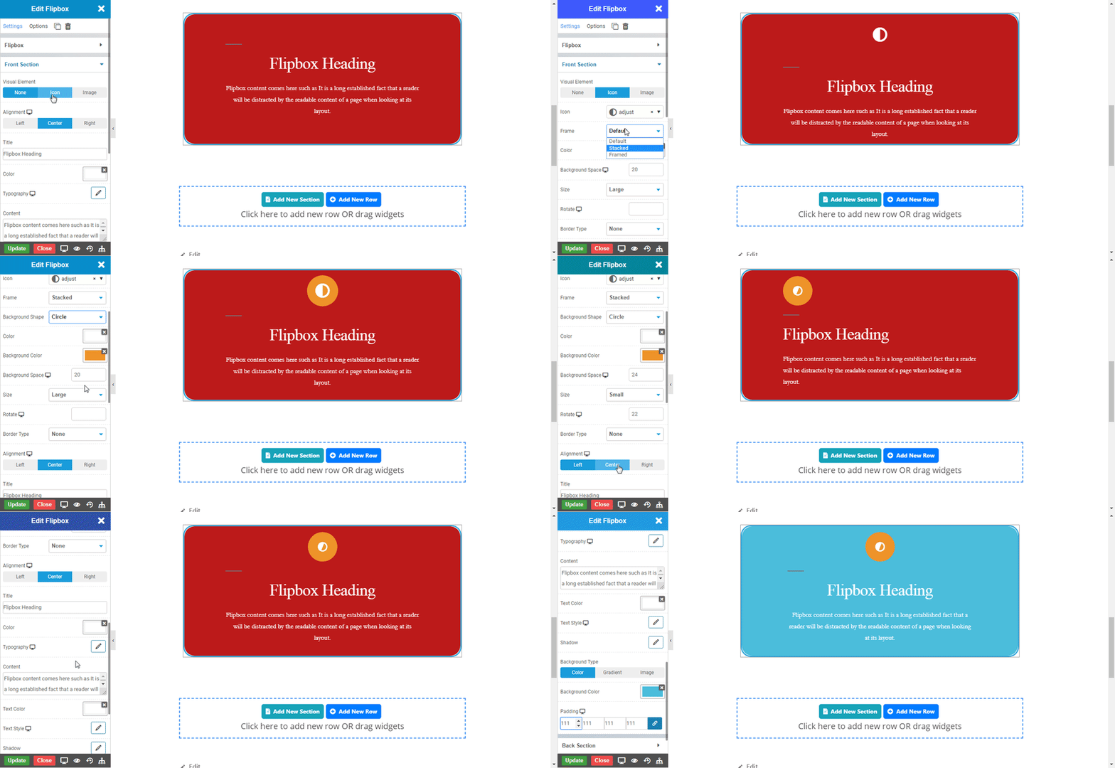
  • Visual Element : Select if you want to display icon or image in the flipbox and none if nothing is to display in front section.
  • Alignment : Set the alignment of the heading and content to left, right, or center in front section.
  • Title : Enter the text in title to display as heading in front section.
  • Color : Choose the color of the heading text in front section.
  • Typography : Choose the Font-name, size, boldness, text-decoration, letter-spacing in front section.
  • Content : Enter the text in content to display as description in front section.
  • Text Color : Choose the color of the content text in front section.
  • Text Style : Choose the Font-name, size, boldness, text-decoration, letter-spacing to content text in front section.
  • Shadow : Set shadow to the flipbox in front section.
  • Background Type : Choose the type of background you want in flipbox background in front section.
  • Color : Choose if you want to display color as a background in front section.
  • Gradient : Choose if you want to display gradient as a background in front section.
  • Image : Choose if you want to display image as a background in front section.
  • Padding : Set the padding to the flipbox in front section.
flipbox_front

Back Section

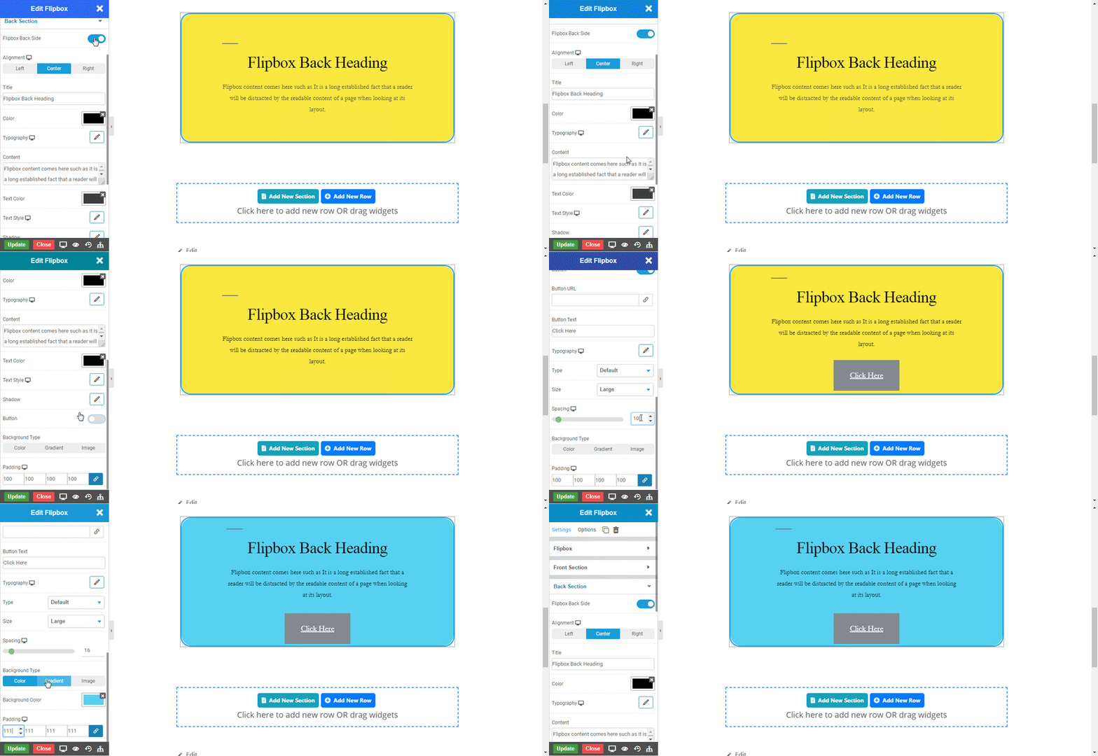
  • Flipbox back side : Enable the toggle if you want to display the backside section always.
  • Alignment : Set the alignment of the heading and content to left, right, or center in back section.
  • Title : Enter the text in title to display as heading in back section.
  • Color : Choose the color of the heading text in back section.
  • Typography : Choose the Font-name, size, boldness, text-decoration, letter-spacing in back section.
  • Content : Enter the text in content to display as description in back section.
  • Text Color : Choose the color of the content text in back section.
  • Text Style : Choose the Font-name, size, boldness, text-decoration, letter-spacing to content text in back section.
  • Shadow : Set shadow to the flipbox in back section.
  • Button : Enable the toggle to display button in back section, with all its functionalities. 
  • Background Type : Choose the type of background you want in flipbox background in back section.
  • Color : Choose if you want to display color as a background in back section .
  • Gradient : Choose if you want to display gradient as a background in back section.
  • Image : Choose if you want to display image as a background in back section.
  • Padding : Set the padding to the flipbox in back section.
flipbox_back
NOTE - In advance option tab . Do more styling to the Flipbox Widget. To know more about advance option tab. CLICK HERE

    Was this page helpful?
    Newsletter Subscription
    Subscribing you to the mailing list