pagelayer-logo-256
Request A Demo
By entering your email, you agree to our Terms of Service and Privacy Policy
love-subscribe

Download Pagelayer Plugin

Subscribe to our Newsletter for WordPress related news and tutorials and get a 25% discount !

New year Offer
35% Off

Offer Expired

Days
Hours
Minutes
Seconds
COUPON CODE - NEWYEAR
Download
Row

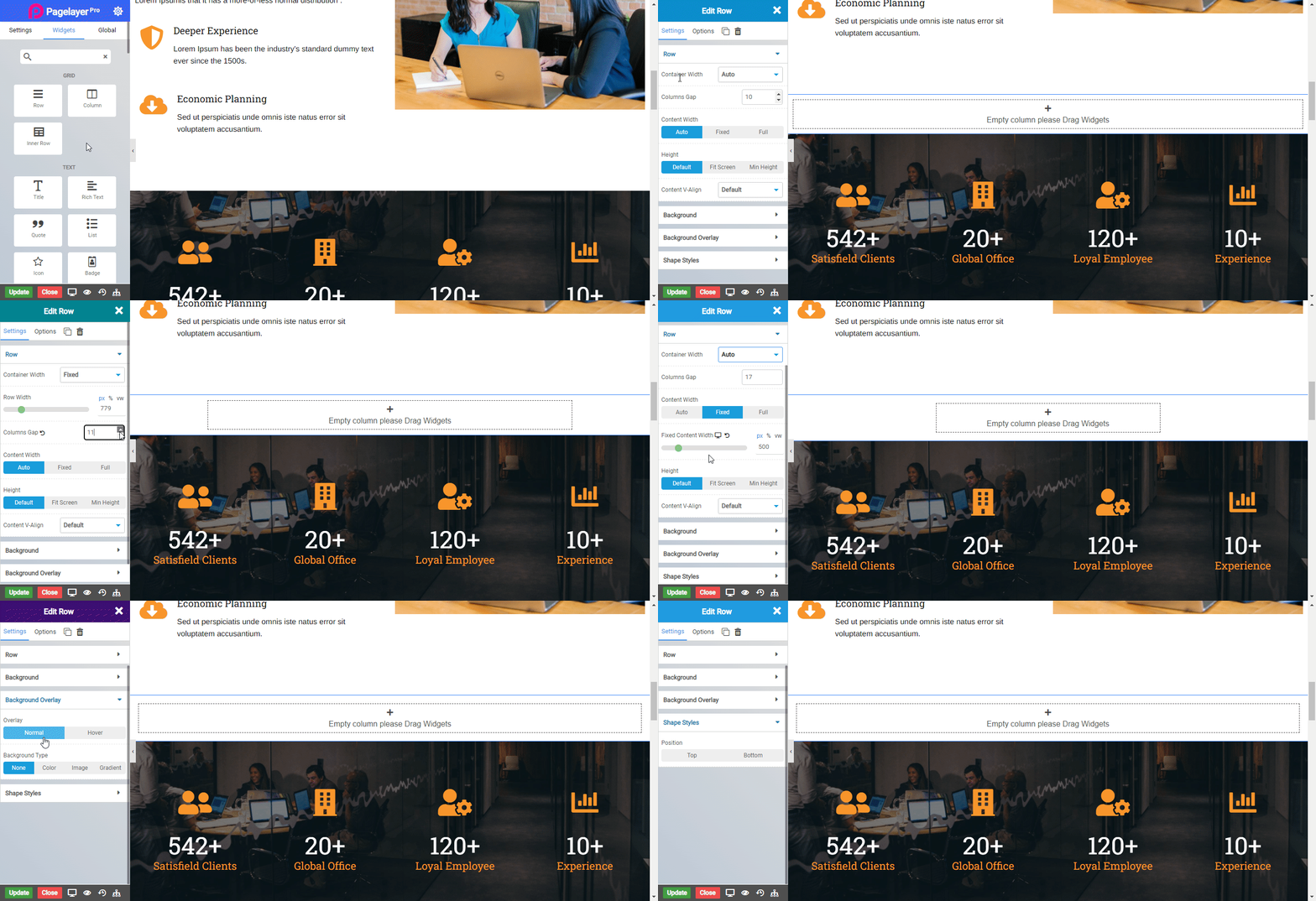
Row Widget are wrappers for columns. A Row widget is used to display other widgets in a single div. When other widget are placed within the Row then it will simply display the other widgets that are visible within view.

Row Widget is an extremely important part of the page building process. They are containers that allow you to place any element, widget or content inside of them.
row_01

Pagelayer's grid system allows up to only 12 columns inside the row. If you do not want to use all 12 columns individually, you can group the columns together to create wider columns:

Span 1

Span 1

Span 1

Span 1

Span 1

Span 1

Span 1

Span 1

Span 1

Span 1

Span 1

Span 1

Span 3

Span 3

Span 3

Span 3

Span 4

Span 4

Span 4

Span 4

Span 8

Span 6

Span 6

Span 12

Content

  • Container Width : Choose the width for the particular row eg - Auto (Width of the main Container), Full (Full width of the device), Fixed (as per user define),
  • Row Width (Option only available for fixed-width) : Set the width for the row in px (pixel unit).
  • Column Gap : Set the space between each column widget you use inside the row.
  • Content Width : Set the max-width of the content inside the row eg - Auto (Width of the row), Fixed (as per user define), Full (Full width of the device).
  • Fixed (Option only available for fixed-width) : Set the width for the row in px (pixel unit).
  • Height : Set the height of the column eg - Default (original height of the row), Fit screen (as per the height of the user device), Min-height (minimum height as per user define).
  • Min height (Option only available for Min Height) : Set the Min height for the row in px (pixel unit).
  • Column V-align : Set the vertical alignment of the columns inside row eg- Default, Top, Center, Bottom, Stretch.
  • Content V-align : Set the vertical alignment of an element inside the row eg- Default, Top, Center, Bottom Stretch.
  • Background

  • Background Type : Choose the background for the ROW eg - None, Video, Parallax, Slider.
  • Video URL (Option only available for Video) : Set the ROW background to your choice of video.
  • Mute (Option only available under Video) : Enable this option to mute the Video Background.
  • Stop Looping (Option only available under Video) : Enable this option to play the video background only once on loading.
  • Image (Option only available under Parallax) : Set the ROW background to your choice of parallax image.
  • Edit Slides (Option only available under Slider) : Select the image for ROW background slider to your choice of sliding image.
  • Speed (Option only available under Slider) : Set the speed of rotation for sliding image (in millisecond).
  • Overlay

  • Delay (Option only available for HOVER) : Set the time it takes to appear. This time is in milliseconds, so 1000 ms is equal to 1 second.
  • Overlay Type : Choose the type of overlay for column eg - None, Color, Gradient, Image.
  • Color Overlay

  • Color : Choose the overlay color for the column.
  • Transparency : Set the transparency of the overlay type.
  • Gradient Overlay

  • Angle : Set the angle of the gradient color to be displayed from 0 to 360 degree.
  • Color 1 : Choose the first gradient color.
  • Percentage : Choose the percentage of the first gradient color to be displayed.
  • Color 2 : Choose the second gradient color.
  • Percentage : Choose the percentage of the second gradient color to be displayed.
  • Color 3 : Choose the third gradient color.
  • Percentage : Choose the percentage of the third gradient color to be displayed.
  • Transparency : Set the transparency of the overlay type.
  • NOTE - The percentage total of all three gradient color should not exceed 100 for it to work efficiently.

    Image Overlay

  • Image : Select the image you want to display as an overlay.
  • Attachment : Set the image attachment type eg - Default, Scroll(Scrollable), Fixed(Parallax).
  • Position - X : Set the horizontal position of the image for overlay eg - Default, Center, Left, Right.
  • Position - Y : Set the vertical position of the image for overlay eg - Default, Center, Top, Bottom.
  • Repeat : Set the overlay image to repeat itself if space is available eg - Default, Repeat (image will be repeated horizontally and vertically as per available space) , No-Repeat (image will not be repeated), Repeat-X (image will be only repeated horizontally), Repeat-Y (image will be only repeated vertically).
  • Size : Set the size of the overlay image eg - Cover (image takes full available space), Contain (actual size of the image not exceeding column size).
  • Transparency : Set the transparency of the overlay type.
  • Shade Style

  • Position : Select the position where you want to display shade.
  • Type : Select the style of the shade you want to use.
  • Color : Set the color of the shade style.
  • Width : Set the width of the shade style.
  • Height : Set the height of the shade style.
  • Flip : Flip the shade to other direction.
    • Was this page helpful?
      Newsletter Subscription
      Subscribing you to the mailing list