
Overview
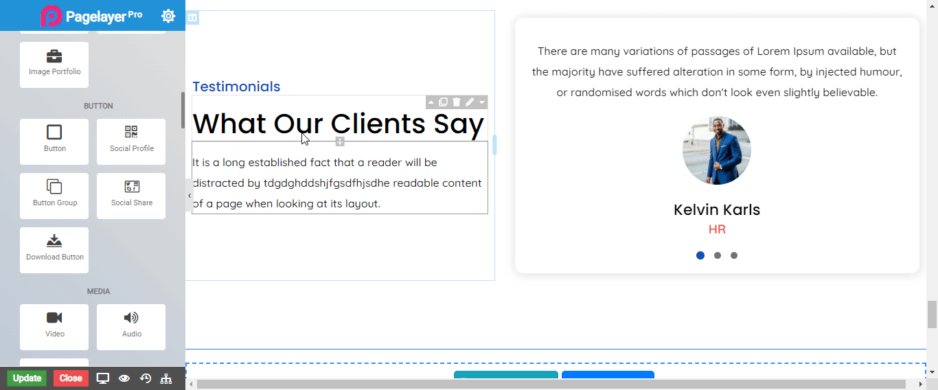
The Button Widget allows you to easily design and customize the buttons without any other plugins or shortcodes.
Button
- Button Text : Enter the Button text.
- Link : Enter the URL for Button link.
- rel : Enter the relationship between the current element and the linked one.
- Open link in new window (tab) : To open link in new window (tab), click on slider button.
- Stretch : To stretch the button click on slider button.
- Typography : Choose the typography for button text.
- Alignment : Select the alignment for text in the button, default is left.
Button Style
- Type : Select the styles of buttons to begin your design. Choose from Primary, Success, Info, Warning, Danger etc. If you want to design your own button from other than these options then select Custom from the drop down, after selecting the custom you will get the option State in which you can design the button in Normal and Hover State.
- Size : Select the Size of button, default is selected to large. Choose from Mini, Small, Large, Extra Large, Double Large. If you want to give size to your own button from other than these options then select Custom from the drop down, after selecting the custom you will get the input State in which you can give any size but it should be less then hundered.
Normal
- Background Color : Set the button background color
- Color : Set the button text color
Hover
- Hover Speed : Set the time for hover effect
- Background Color : Set the background color on hover
- Color : Set the button text color on hover
Icon
- Icon : Select a Font Awesome icon to display on the button
- Alignment : Set the icon to appear before or after the button text
- Space Between : Set the space between the icon and button text
Border
Normal
- Border Type : Choose the border type from Solid, Double, Dotted, Dashed, and Groove.
- Border Color : Set the Border Color
- Border Width : Set the width to control the thickness of the border around the button
- Border Radius : Set the border radius to control corner roundness
Hover
- Border Type : Choose the border type from Solid, Double, Dotted, Dashed, and Groove.
- Border Color : Set the Border Color
- Border Width : Set the width to control the thickness of the border around the button
- Border Radius : Set the border radius to control corner roundness
Scroll to Element
- Enable : Enable to active scroll to Element .
- Scroll to : Choose options Top or Element .
- Animation Speed : Give animation speed from here maximum is 10 .
NOTE - In advance option tab . Do more styling to the Button Widget.To know more about advance option tab. CLICK HERE