Overview
The Image Portfolio Widget allows you to embed set of images together in web pages also you can divide images in particular categories and filter accordingly.
Screenshot
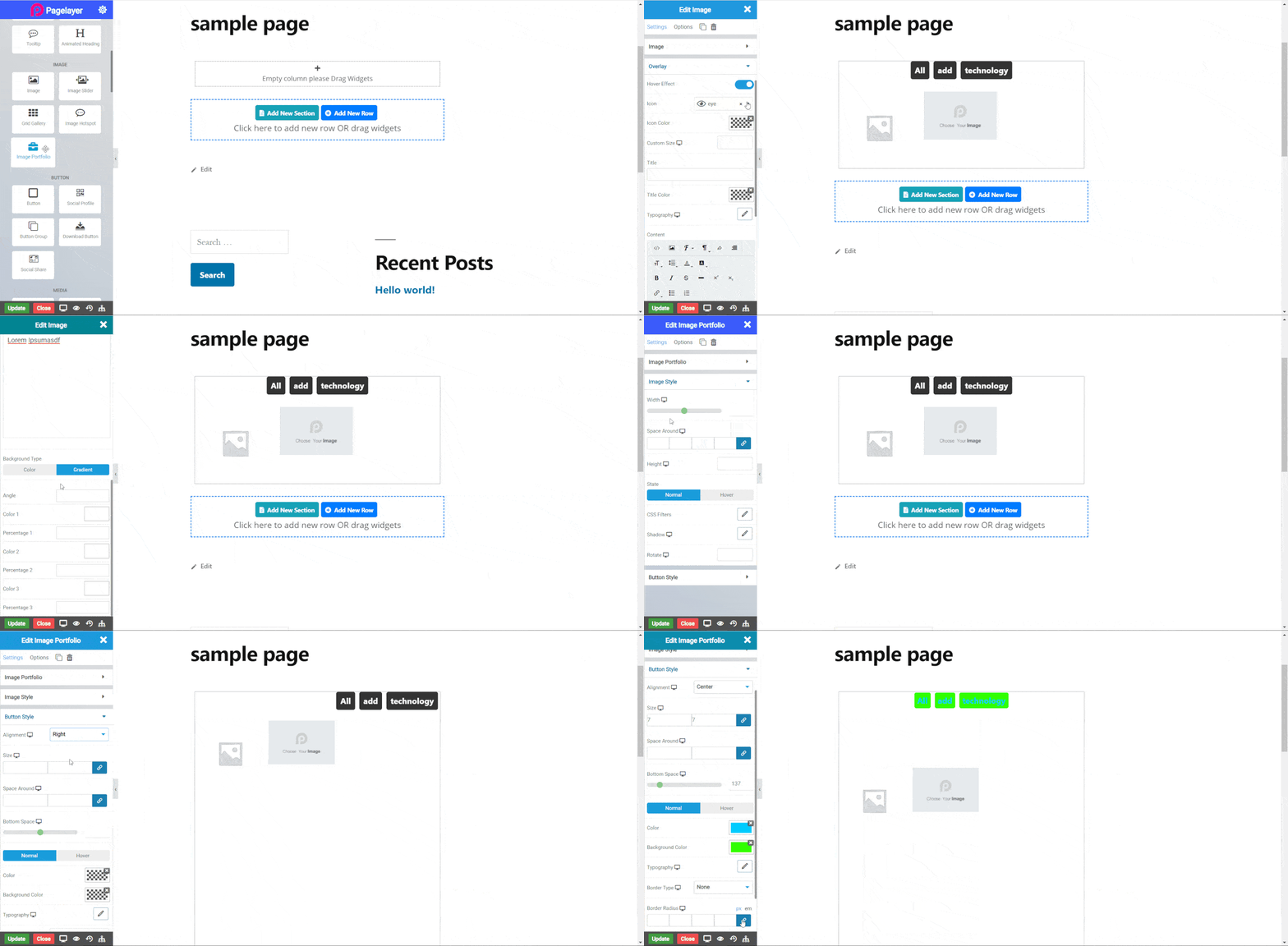
The following is a GIF video to show you how to use the Image Portfolio widget and the various options available :

Image Portfolio Widget
The following is a image portfolio widget :

Image Portfolio
Image
- Select Image : Add the image you want to display on your web page.
- Size: Select the size of the image to be displayed.
- Category : Set the category of the image.
- Link to : Select an option to link image from None, Custom file (add a url of any web page), Media file (add rel value of your page or anything), lightbox (a lightbox is attached without any link).
- Overlay : Toggle to set overlay of icon and text over image. CLICK HERE to see more.
Button Style
To add more style to the button, CLICK HERE to see information about button styling
- Disable Category : Enable or disable the category Button.
- Alingment : Give the alignment to button.
- Size : Give the size to the buttons.
- Space Around : Give the space round to the Button .
- Bottom Space : Add space to the Bottom of Button .
Normal
Hover
- Hover Speed : Set the time for hover effect
- Background Color : Set the background color on hover
- Color : Set the button text color on hover
- Border Type : Choose the border type from Solid, Double, Dotted, Dashed, and Groove.
- Border Color : Set the Border Color
- Border Width : Set the width to control the thickness of the border around the button
- Border Radius : Set the border radius to control corner roundness
NOTE - In advance option tab . Do more styling to the Image Portfolio Widget. To know more about advance option tab. CLICK HERE


