pagelayer-logo-256
Request A Demo
By entering your email, you agree to our Terms of Service and Privacy Policy
love-subscribe

Download Pagelayer Plugin

Subscribe to our Newsletter for WordPress related news and tutorials and get a 25% discount !

New year Offer
35% Off

Offer Expired

Days
Hours
Minutes
Seconds
COUPON CODE - NEWYEAR
Download
Archive Posts

Overview

The Archive Posts Widget displays list of any posts within archive templates with all sorts of customization. 

Screenshot

The following is a GIF video to show you how to use the archive posts widget and the various options available :
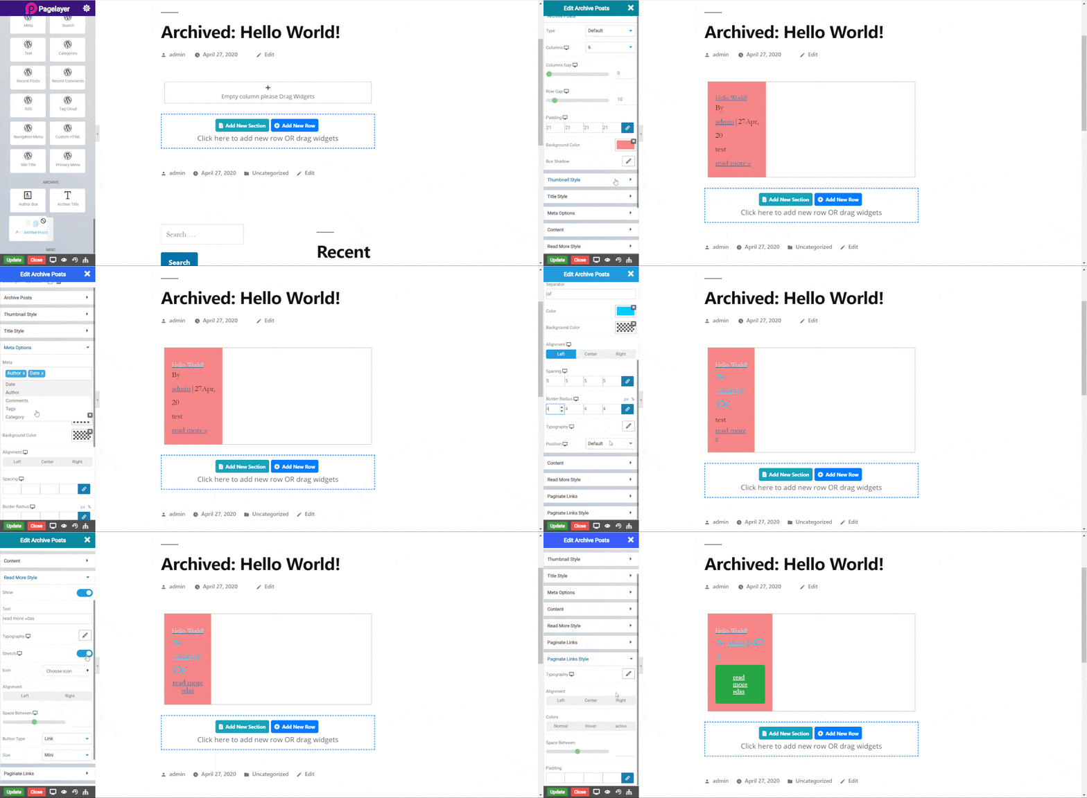
archive post

Archive Posts

  • Type : Select type of posts.
  • Infinte Scroll : Give the infinte scroll to the post. None, Button ,Auto
  • Column : Select number of column wanted in a row.
  • Columns Gap: Set gap between columns.
  • Row Gap : Set gap between rows.
  • Padding : Set padding of post box.
  • Background Color : Set background color of post box.
  • Box Shadow : Set shadow of post box.

Screenshot

The following is a GIF video to show you how to use the Infinite scroll features.
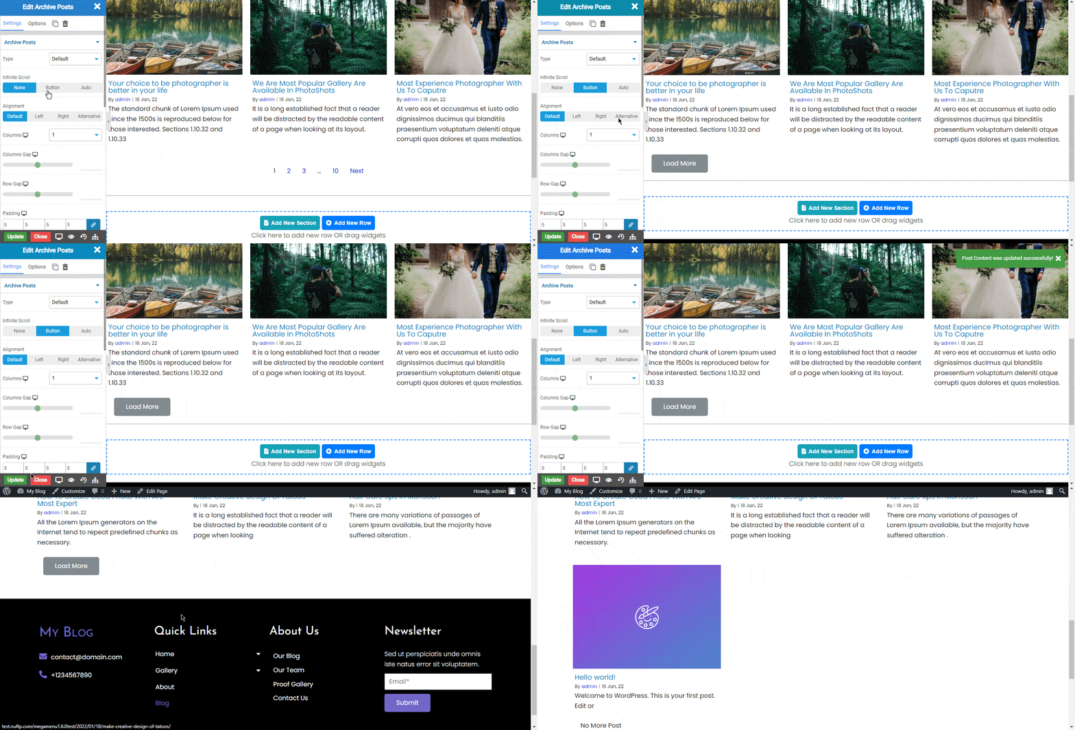
infinte scroll_01

In the Infinte Scroll there are two types.

  • Button : When Click On load more button.It will load the new Blog post are available.
  • Auto : It will Automatically load new blog post when we will reach at end of page.

There are 4 types of alignment options available.

  • Default : Aligns post content on the bottom of the thumbnail.
  • Left : Aligns post content on the left of the thumbnail.
  • Right : Aligns post content on the right of the thumbnail.
  • Alternative: Aligns post content on each side of the post alternatively.

Thumbnail Style

  • Show Thumbnail: Toggle to display image thumbnail.
  • Type :Select size of thumbnail.
  • Height Ratio  : Set height ratio of the thumbnail.

Title Style

  • Show Title: Toggle to display post title.
  • Color :Set color of title.
  • Typography :Set the font and text style of post title.
  • Top Bottom Spacing : Set space around post title.

Meta Options

  • Meta : Set extra details of posts.
  • Separator :Set any separator between meta details.
  • Color :Set color of meta details.
  • Background Color : Set background color of meta details.
  • Alignment : Set alignment of the meta details.
  • Spacing : Set spacing around details.
  • Border Radius : Set radius of the border.
  • Typography  : Set the font and text style of meta details.
  • Position : Select position type of the meta details.

Content

  • Show Content: Select any extra content to show.
  • Color :Set color of content.
  • Padding :Set padding of content.
  • Alignment : Set alignment of the content.

Read More Style

  • Show : Set alignment of the content.
  • Text :Set text of text extending option.
  • Typography :Set the font and text style of read more text.
  • Alignment : Set alignment of the read more.
  • Icon : Set icon in read more.
  • Alignment : Set alignment of read more icon.
  • Space Between : Set space between text and icon.
  • Type : Select the styles of buttons to begin your design. Choose from Primary, Success, Info, Warning, Danger etc. If you want to design your own button from other than these options then select Custom from the drop down, after selecting the custom you will get the option State in which you can design the button in Normal and Hover State.
  • Size : Select the Size of button, default is selected to Mini. Choose from Mini, Small, Large, Extra Large, Double Large. If you want to give size to your own button from other than these options then select Custom from the drop down, after selecting the custom you will get the input State in which you can give any size but it should be less then hundered.

Paginate Links

  • Pagination :Select type of pagination
  • Pagination On : Set location of pagination.
  • Previous Text :Set previous link text.
  • Next Text : Set next link text.
  • Pagination End Size : Set end numbers value of pagination.
  • Pagination Mid Size : Set mid numbers value of pagination.
  • Before Page Number : Set text display before page number.
  • After Page Number : Set text display after page number.

Paginate Links Style

  • Typography :Set the font and text style of pagination number.
  • Alignment :Set alignment of pagination number.
  • Space Between :Set space between text and icon.
  • Next Text : Set next link text.
  • Padding : Set padding of content.

Color

Normal
  • Color :Set the paginate color.
Hover
  • Color :Set on hover color to the paginate.
Active
  • Color :Set color to the active paginate.
  • Space Between : Set space between the paginations.
  • Padding: Set padding of pagination.

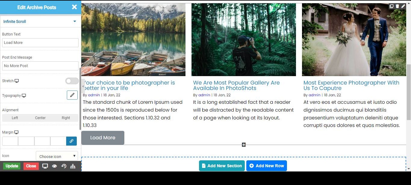
Infinte Scroll

infinite scroll_02
  • Button Text :From Here you can change the button text .
  • Post End Message : At the end all post will get over then can see this message.
  • Stretch : Enable this toggle the button will get stretch.
  • Typography : We can change the button typography.
  • Margin : Add the margin to Button
  • Icon : Select the icon from the list of icons
  • Alingment : Give the alignment to icon
  • Type :Select the type of button as Default,Primary,Secondary and etc.
  • Size :Select the Size of button as Mini, Large, Extra-large and etc.

Shadow

  • Horizontal : Set the horizotal views
  • Vertical : Set the vertical views
  • Blur :Give the Blur values .
  • Spread :Give the spread values.
  • Color :Set the color.
  • Shadow :Choose the shadow type Outset or Inset

Shadow on Hover

  • Horizontal : Set the horizotal views
  • Vertical : Set the vertical views
  • Blur :Give the Blur values .
  • Spread :Give the spread values.
  • Color :Set the color.
  • Shadow :Choose the shadow type Outset or Inset

Border Types

Select the Border type Solid,Double,Dashed,Dotted and etc.

NOTE - In advance option tab . Do more styling to the Archive Post Widget. To know more about advance option tab. CLICK HERE

    Was this page helpful?
    Newsletter Subscription
    Subscribing you to the mailing list