Overview
The Modal Widget allows you to embed Modal according to your needs in seconds. This is fully customizable widget.
Screenshot
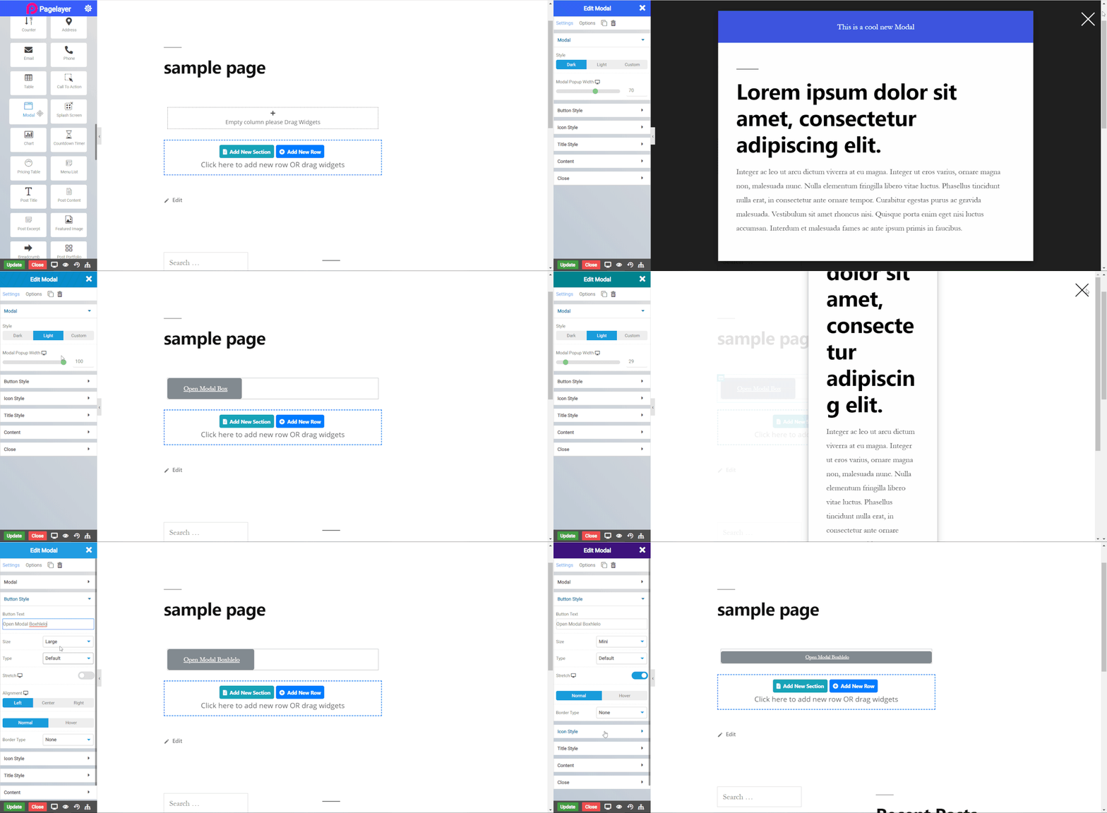
The following is a GIF video to show you how to use the Modal widget and the various options available :

Modal Widget
The following is a Modal widget :
Modal
- Style : Select background color of modal. Dark, light and custom, in custom you have to select your own custom background color.
- Modal Popup Width : Set width of modal.
Button Style
- Button Text : Enter the Button text.
- Size : Select the Size of button, default is selected to large. Choose from Mini, Small, Large, Extra Large, Double Large. If you want to give size to your own button from other than these options then select Custom from the drop down, after selecting the custom you will get the input State in which you can give any size but it should be less then hundered.
- Type : Select the styles of buttons to begin your design. Choose from Primary, Success, Info, Warning, Danger etc. If you want to design your own button from other than these options then select Custom from the drop down, after selecting the custom you will get the option State in which you can design the button in Normal and Hover State.
- Stretch : To stretch the button click on slider button.
- Alignment : Select the alignment for text in the button, default is left.
Normal
- Border Type : Choose the border type from Solid, Double, Dotted, Dashed, and Groove.
- Border Color : Set the Border Color.
- Border Width : Set the width to control the thickness of the border around the button.
- Border Radius : Set the border radius to control corner roundness.
Hover
- Hover Speed : Set timing of hover.
- Border Type : Choose the border type from Solid, Double, Dotted, Dashed, and Groove.
- Border Color : Set the Border Color.
- Border Width : Set the width to control the thickness of the border around the button.
- Border Radius : Set the border radius to control corner roundness.
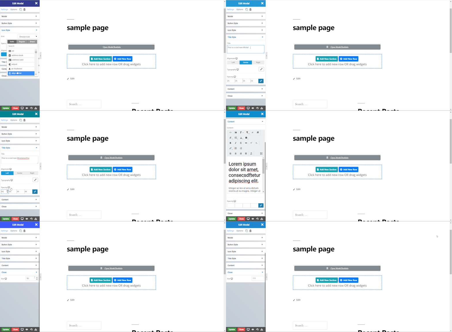
Icon Style

- Icon : Select a Font Awesome icon to display on the button.
- Space Between : Set space between icon and the text on the button.
- Alignment : Set the icon to appear before or after the button text.
Title Style
- Title : Enter title for modal.
- Alignment : Select the alignment for title in the modal.
- Typography : Set the font and text style of modal title.
- Spacing : Set the padding around modal title.
Content
- Text : Enter text and edit the text. CLICK HERE to see more.
- Spacing : Set the padding around modal content text.
Close
- Size : Set size of close button.
- Close by Overlay : Toggle to close the modal box by clicking on the overlay.
NOTE - In advance option tab . Do more styling to the Modal Widget. To know more about advance option tab. CLICK HERE


