
Overview
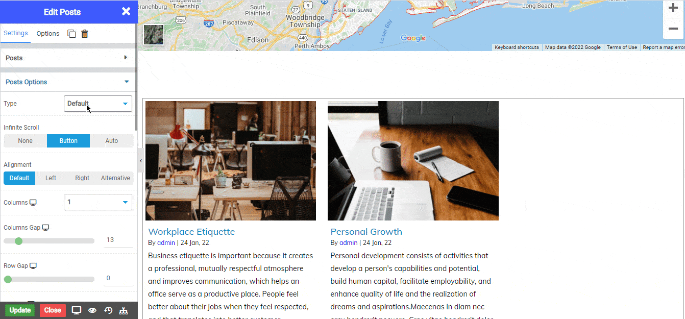
The Posts widget allows you to fetch and design the selected posts inside the page or post without need of any other plugins.
Inside this widget you have options which allows you to organize and customize your posts and display as per your needs.
Options
Contents
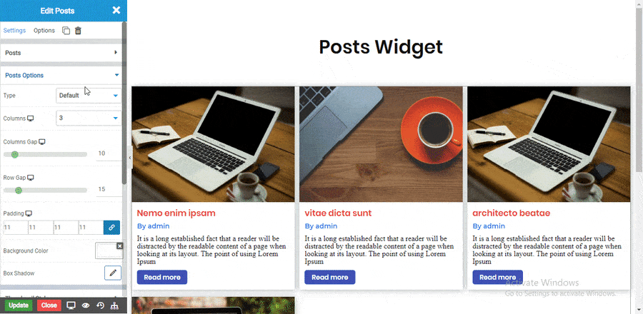
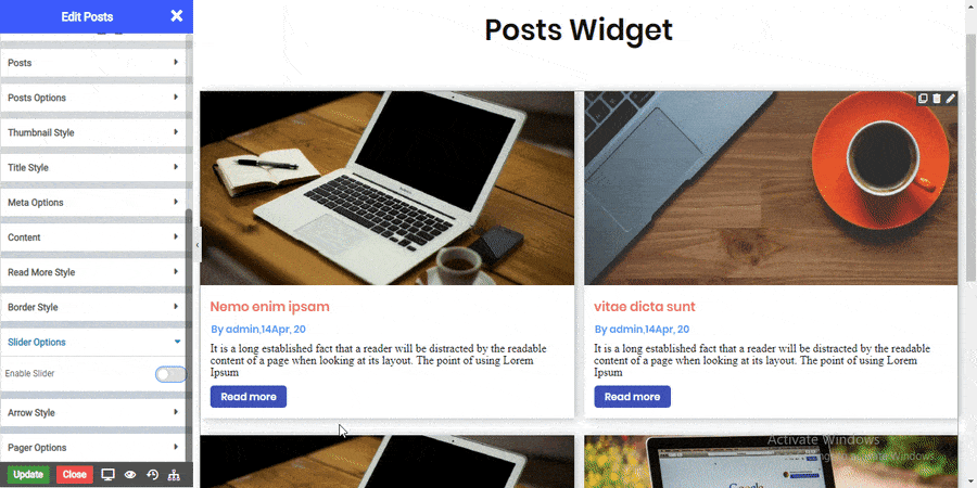
Posts Options
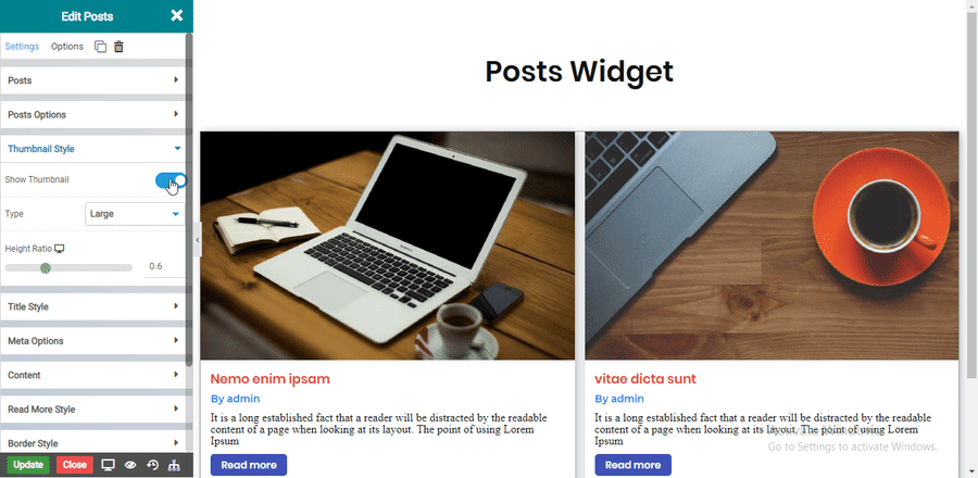
Thumbnail Style
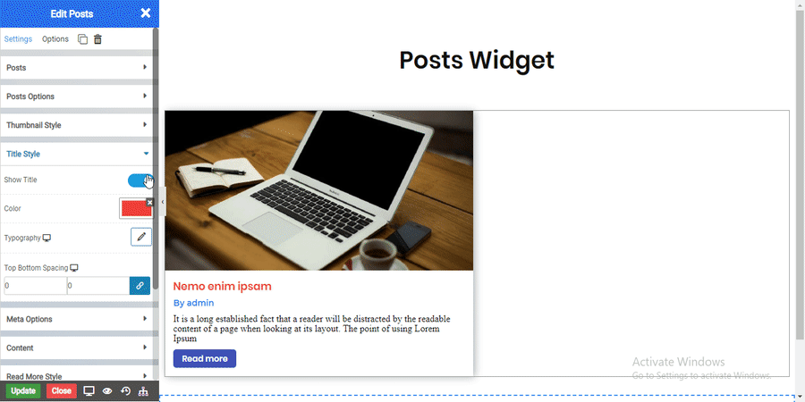
Title Style
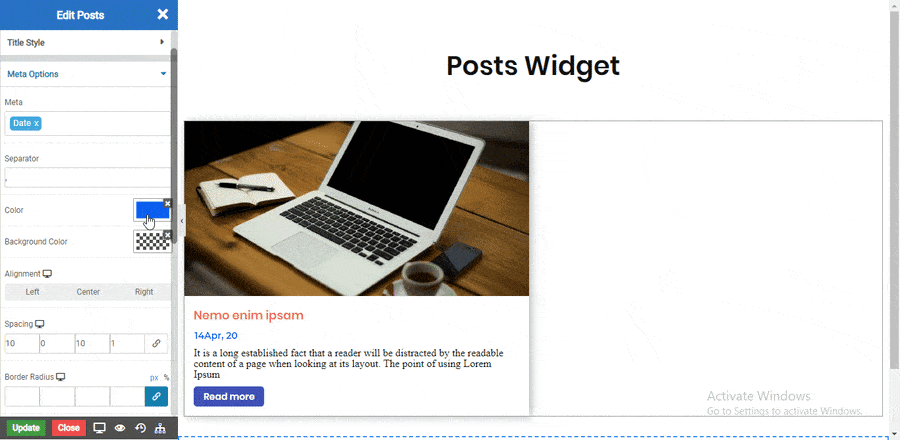
Meta Options
Post Content
Read More Style
Border Style
Solid Border
Double Border
Dotted Border
Dashed Border
Groove Border
Slider Options
Arrow Style
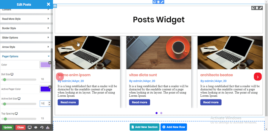
Pager Options
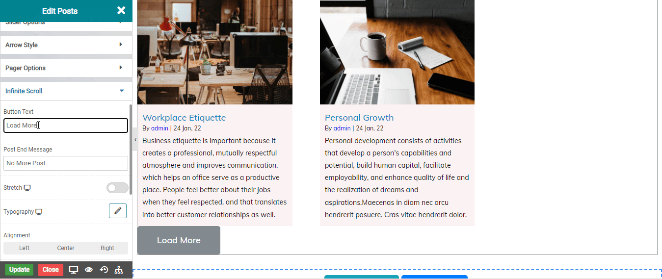
Infinte Scroll
Shadow
Shadow on Hover
Border Types
Select the Border type Solid,Double,Dashed,Dotted and etc.
NOTE - In advance option tab . Do more styling to the Posts Widget. To know more about advance option tab. CLICK HERE