
Overview
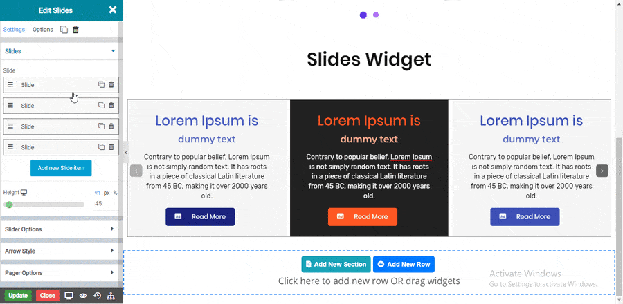
The Slides widget allows you to create a slider inside page or posts without need of any other plugins. Inside this widget you have many options which allows you to design your slides as per your needs.
Options
Contents
Slides : This option allows you to add number of slides in your slider.
Solid Border
Double Border
Dotted Border
Dashed Border
Groove Border
Slider Options

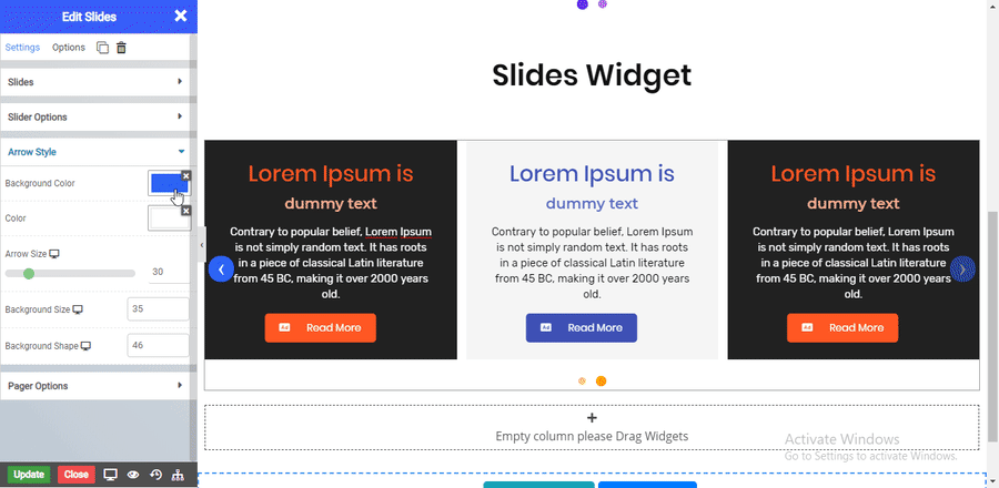
Arrow Style
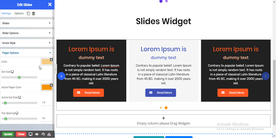
Pager Options
NOTE -In advance option tab . Do more styling to the Slides Widget. To know more about advance option tab. CLICK HERE