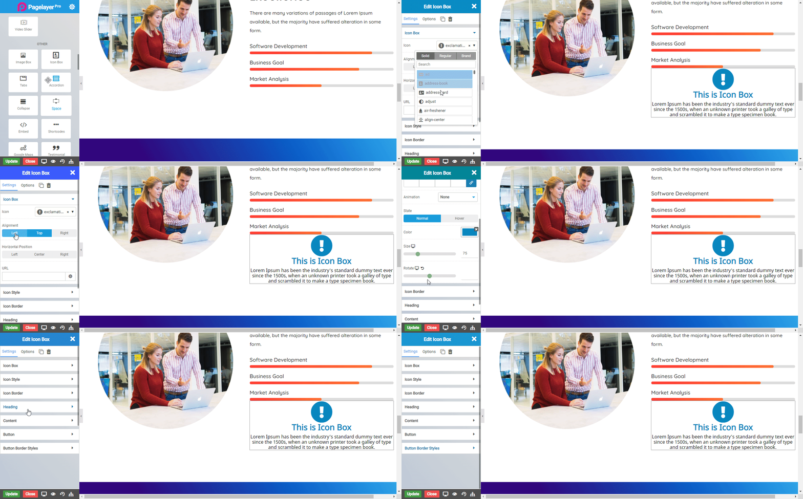
The Icon Box Widget are simply awesome and they are fully integrated with the Font Awesome icon set. The most common usage is for sections that list features of products or services, we can customize the every element of this widget: the icon, the headline and the descriptions.

Icon Box
- Icon : Choose the icon from Font Awesome Icon set
- Alignment : Align the icon to left ,top and right
- Vertical Alignment : Align the icon vertically to top, middle and bottom
Icon Style
- Frame : Set the view of the icon as Default, Stacked or Framed. Stacked is with background and frame is with a frame surrounding the icon
- Shape : Choose the shape of frame and background space to Circle or Square
- Padding : Set the background space around the icon
- Spacing : Set the background space from outside the icon
Normal
- Color : Set the icon color
- Background Color : Set the background color around the icon
- Size : Set the size of icon
- Rotate : Rotate the icon
Hover
- Delay : Set the delay time to apply the hover effects
- Animation : Choose the Animation from the given options available in the drop down.
- Color : Choose the background color
- Size : Set the size of icon
- Rotate : Rotate the icon
Icon Border
Normal
- Border : Choose the border from the options available in the drop down
- Color : Choose the border color
- Width : Set the border width
- Border Radius : Set the border radius
Hover
- Border : Choose the border from the options available in the drop down
- Color : Choose the border color
- Width : Set the border width
- Border Radius : Set the border radius
Heading
- Heading : Enter the description heading of icon box
- Bottom Spacing : Set the bottom space between the heading and the description
- Color : Set the color of heading text
- Typography : Choose the typography
Content
- Content Alignment : Choose the whole content to align Left, Right, Center and Justify
- Spacing : Add the spacing to content area .
- Content : Enter the description of icon box
Button
- Show Button : Click to slide button to add button in your icon box
- Button Type : Choose the type of buttons available from the options, or else you can select Custom from the options to design your own button
- Size : Choose the size of button from the options available in drop down
- URL : Enter the link to set the URL of button
- Label : Enter the Button text
- Top Spacing : Set the spacing from the top
- Button State : Choose the Hover or Normal State
Normal
- Color : Set the button text color
- Background Color : Set the background color of button
Hover
- Delay : Set the delay time for hover effects
- Color : Set the button text color
- Background Color : Set the background color of button
Button border style
Normal
- Border Type : Choose the border type from Solid, Double, Dotted, Dashed, and Groove.
- Border Color : Set the Border Color
- Border Width : Set the width to control the thickness of the border around the button
- Border Radius : Set the border radius to control corner roundness
Hover
- Border Type : Choose the border type from Solid, Double, Dotted, Dashed, and Groove.
- Border Color : Set the Border Color
- Border Width : Set the width to control the thickness of the border around the button
- Border Radius : Set the border radius to control corner roundness
NOTE - In advance option tab . Do more styling to the Icon Box Widget.To know more about advance option tab. CLICK HERE


