
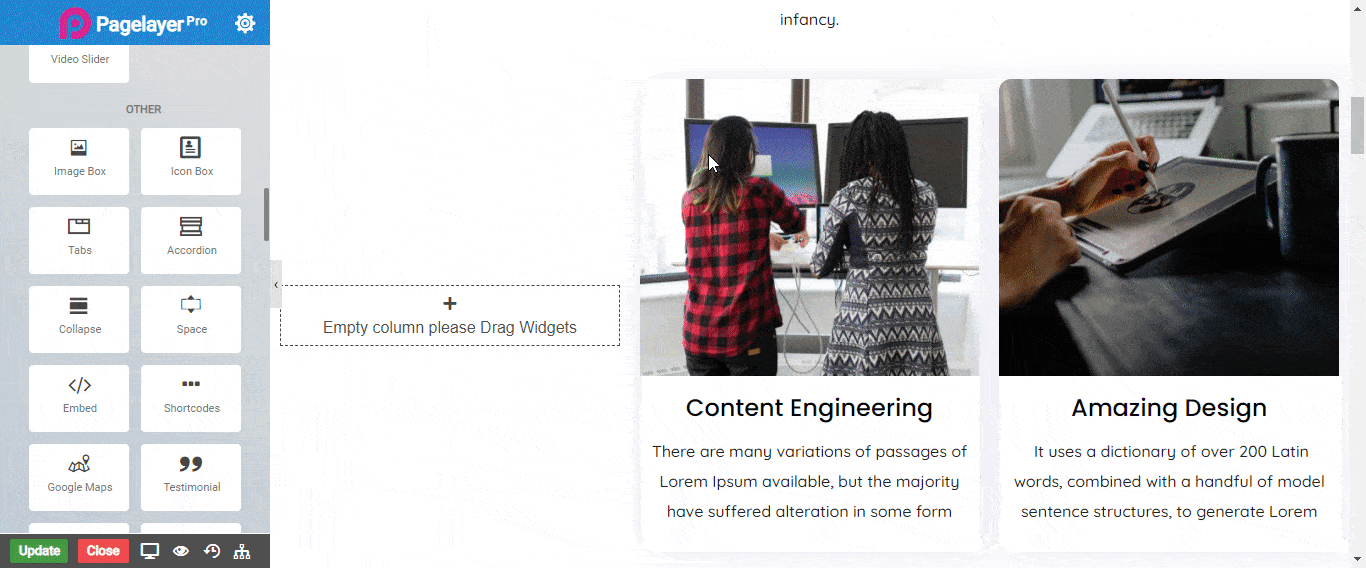
The Image Box Widget lets you add an image box that combines an image with a headline and text.
You can now, with the help of Image Box Element, include a small biography for the image on your website. With several customization options to utilize you have the power to display images with style and ease.
Change the picture size, shape, text background color and more with the customization settings included in the Image Box Widget.
Content
- Image : Select the image you want to display.
- Size : Choose the size of the image to be displayed as Full, Thumbnail or Custom size.
- Animation : Add hover animation for the image. CLICK HERE to see animation in action.
Image style
- Alignment : Set the alignment of the image.
- Vertical Alignment : Align the content to the top, middle or bottom of the box.
- Spacing Around : Set the exact spacing around image i.e Top, Right, Bottom, Left respectively.
- State : Select the state to edit.
- Border : Select the border type to display.
- Color : Set the color of the border.
- Width : Set the width of the border in pixel(px) unit.
- Radius : Set the border curve around corners i.e Top, Right, Bottom, Left respectively.
Heading
- Heading Text : Type the text you want to display.
- Bottom Spacing : Set the space between the title and description.
- State : Select the state to edit.
- Delay : Set the time it takes to appear. This time is in milliseconds, so 1000 ms is equal to 1 second
- Color : Choose the color for your text.
- Typography : Choose the Font-name, size, boldness, text-decoration, letter-spacing.
Content
- Alignment : Set the alignment of the Text.
- Spacing : Add the spacing to content area .
- Content : Type here some text to display on hover effect. CLICK HERE to see the styling of text in this widget.
Button
- Show Button : Toggle this button to display the bottom button.
- Type : Select the color for the button from bootstrap button color or set your custom colors.
- Size : Set the size of the button.
- URL : Set the link for the button.
- Text : Type the text you want to display on the button.
- Top Spacing : Set the spacing between the content and the button.
- State : Select the state to edit.
- Delay : Set the time it takes to appear. This time is in milliseconds, so 1000 ms is equal to 1 second
- Color : Choose the color for your text of the button.
- Background Color : Choose the background color for the button.
Button border style
Normal
- Border Type : Choose the border type from Solid, Double, Dotted, Dashed, and Groove.
- Border Color : Set the Border Color
- Border Width : Set the width to control the thickness of the border around the button
- Border Radius : Set the border radius to control corner roundness
Hover
- Border Type : Choose the border type from Solid, Double, Dotted, Dashed, and Groove.
- Border Color : Set the Border Color
- Border Width : Set the width to control the thickness of the border around the button
- Border Radius : Set the border radius to control corner roundness
NOTE - In advance option tab . Do more styling to the Image Box Widget. To know more about advance option tab. CLICK HERE